
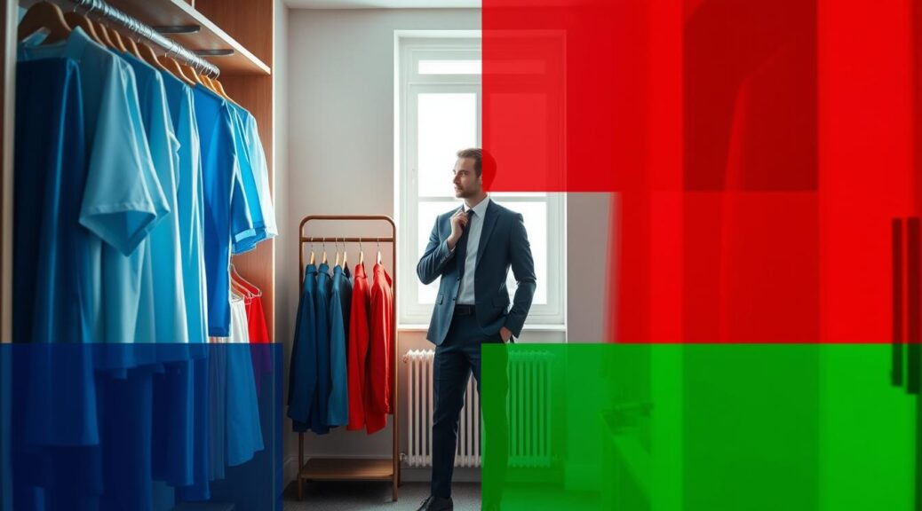
Your headshot is more than a photo; it’s a first impression. That navy blazer isn’t just fabric; it’s saying “trust me” before you even speak.
Red isn’t just a color; it’s a powerful statement. Warm tones like crimson and gold show passion and energy. Cool blues and greens, on the other hand, convey calm professionalism.
Neutral wardrobe colors are like Swiss Army knives—they’re versatile but might be a bit dull. We’ll look into how culture and personal feelings influence how we see things.
This isn’t just about looking good. It’s about using colors to win over people in a professional way.
Best Colors for Different Professions
Have you ever noticed how corporate boardrooms are mostly navy blue and art galleries are full of plum and magenta? It’s not just random. It’s about color psychology and tribal signaling. Each field has its own color language, showing values, trust, and power before words are spoken.
Let’s explore these color choices. Why do bankers wear charcoal suits? And how do healthcare providers’ soft green scrubs affect your blood pressure?
Corporate settings value tradition and trust. Navy blue and charcoal gray are symbols of reliability. Think of James Bond’s classic tuxedos. They show respect and command attention without shouting.
Creative fields have different rules. Artists, designers, and writers often wear teal, rust, or plum. These colors represent innovation and originality. They’re like jazz musicians, improvising in a world of rules.
Healthcare professionals use color to calm patients. Soft blues and greens create peaceful spaces in chaotic medical settings. These colors help patients relax, using color psychology as a form of medicine.
Tech professionals have found the perfect balance. Muted olives and soft blues show they’re both innovative and reliable. They mix creativity with responsibility.
| Industry | Power Colors | Psychological Effect | When to Break Rules |
|---|---|---|---|
| Corporate | Navy, Charcoal | Projects stability and trust | Client creative meetings |
| Creative Fields | Teal, Rust, Plum | Shows innovation and originality | Pitching to conservative clients |
| Healthcare | Soft Blue, Green | Creates calm and trust | Pediatric departments |
| Technology | Muted Olive, Soft Blue | Balances innovation with reliability | Startup launch events |
The best professionals know when to follow and when to break color rules. Sometimes, a navy suit needs a plum pocket square. Or a creative teal blazer might work better with charcoal trousers. It’s about strategic expression, not blind obedience.
Your wardrobe colors can be your professional superpower. They can open doors and build trust before you even speak. The question is, what story do your colors tell about your skills?
Aligning With Brand Values
Your headshot is more than a photo; it’s a statement. Think of Steve Jobs’ black turtleneck or Richard Branson’s bold colors. These choices are not just fashion; they’re powerful personal branding messages.
So, who are you in the corporate world? Are you like IBM’s blue or Amazon’s orange? Or maybe Cadbury’s purple or Netflix’s red? Your colors should tell your story before you even speak.

Doing a brand audit of your professional image is easy. Ask yourself: What three words describe you? Are you a trustworthy advisor, an innovative disruptor, or a compassionate healer? Your answers guide your color choices.
Here’s how top professionals use colors to show their values:
| Brand Value | Color Choice | Psychological Impact | Industry Examples |
|---|---|---|---|
| Trust & Reliability | Navy Blue | Projects stability and competence | Banking, Law, Healthcare |
| Innovation & Creativity | Orange Accents | Shows forward-thinking energy | Tech, Design, Marketing |
| Luxury & Excellence | Deep Purple | Communicates premium quality | Consulting, Finance, Hospitality |
| Energy & Action | Red Elements | Demonstrates drive and passion | Sales, Entertainment, Sports |
That pocket square is more than fabric; it’s a branding opportunity. A subtle tie or scarf in your signature color sends a strong message. It’s like a well-timed joke.
When color psychology meets strategy, magic happens. Blue says “I’ve got this,” while orange hints at the future. Your colors should match your industry and highlight your uniqueness.
Consistency is key. Your LinkedIn headshot, website bio, and conference badges should all match. This isn’t about vanity; it’s about being clear and professional.
Your personal branding through color is not about being the most colorful. It’s about being intentional. In a world of black and white, strategic color makes you stand out.
Dos & Don’ts
Let’s talk about fashion mistakes that haunt headshot photography. Your wardrobe colors can make you shine like Meryl Streep or look like you’re stuck in an 80s music video.
Neon is not a good choice—it screams for help. It reflects on your skin like a nuclear warning. Pure white? It’ll make you look washed out, like you’re trying to hide.
Patterns are their own special circle of hell. Tiny checks might look good in person but create moire effects on camera. It’s like trying to read War and Peace during an earthquake.
Now, let’s talk about the heroes of headshot photography. Navy is your go-to color—it’s like Tom Hanks, always reliable. Emerald green works well with different skin tones, just like Meryl Streep does with different roles.
Charcoal grey is the perfect middle ground. It’s authoritative yet approachable. These camera-friendly colors add depth without distracting from your personality.
Why do these rules work? It’s science. Darker tones create contrast that highlights your features. Muted shades prevent color casting on your skin. Solid colors keep the focus on you.
Can you break these rules? Yes, strategically. A burgundy tie with a navy suit is brilliant. A jewel-toned scarf with charcoal is perfect. Just remember, accents should enhance, not overpower.
Your wardrobe colors should whisper confidence, not scream for attention. Choose shades that make you look like the professional you are, not someone else.
Examples of Successful Looks
Let’s explore how power players use color psychology. These images are more than just looks—they’re lessons in professional communication.
Michelle Obama’s use of jewel tones is a great example. Her red and green outfits show warmth and authority. These colors are inviting but also command respect. It’s like a velvet hammer in politics.

Elon Musk’s simple style is another example. His black or navy outfits are not dull; they’re a smart choice. This simplicity makes him seem focused and serious. It’s like saying, “Let’s focus on what I say, not my clothes.”
Business professionals often choose dark suits with burgundy ties. The dark suit shows they’re competent. The burgundy tie adds a touch of personality. It’s like saying, “I’ll win your case, but I have a soul.”
Creative directors often wear forest green with neutral colors. This choice is both modern and grounded. It’s like a Sequoia tree in style.
Healthcare professionals use soft blues to calm patients. These colors show they’re competent while easing anxiety. It’s like wearing a Mediterranean sea—soothing yet professional.
Why these color choices work:
- Contrast creates definition against backgrounds
- Complementary colors make facial features pop
- Monochromatic schemes project consistency and focus
- Cultural associations reinforce intended messages
These examples show color psychology is real magic. The right colors can make you look more competent, friendly, or innovative. It’s all about the message your colors send.
Now it’s your turn to use color to tell your story. What message will your colors convey?
Preparing for Your Session
Your headshot session is more than just taking a photo. It’s about creating a visual story of your professional identity. Think of it as your personal branding opera – every element must harmonize perfectly.
First, let’s decode your skin’s secret language. Are you cool-toned like a winter morning or warm-toned like golden hour? Check those wrist veins: blue means cool, green means warm. Can’t decide? Welcome to neutral territory – the Switzerland of complexions.
Choosing the right background is key. Navy against grey creates elegant contrast, while navy against navy creates a black hole where your torso should be. Your background should complement, not compete with, your personal branding story.
Test your outfits in natural light – that burgundy that looks rich indoors might scream Christmas card in sunlight. Bring more options than a Cheesecake Factory menu. And please, avoid shiny fabrics that’ll make you look like a disco ball under studio lights.
Here’s your pre-session checklist:
- Conduct skin tone analysis 3 days before
- Test 3-4 outfit options in natural light
- Coordinate colors with your intended background
- Avoid new haircuts or skincare treatments 48 hours prior
- Bring touch-up essentials for quick fixes
Remember: showing up unprepared is like bringing a knife to a color fight. Your headshot is the cornerstone of your personal branding – invest the preparation it deserves.
Conclusion
Your wardrobe colors are more than just clothes. They’re like moves in a game of professional chess. We’ve looked at everything from the right colors for your job to how they match your brand. Your headshot is like a handshake, and the colors you choose show how firm your grip is.
Think of your personal branding as a story you tell with colors. The right colors don’t just look good on you. They show you’re competent, creative, or in charge, even before you speak. It’s not about following rules but understanding why certain colors are best in certain situations.
Tools like Glance AI make this art into science. They help you make your visual story better. Your color choices become smart decisions, not just guesses.
In the professional world, every pixel has a story. Your headshot is more than a photo. It’s your silent pitch, showing who you are and what you stand for. Choose colors that tell the right story about you.
Choosing the right color isn’t just about looking good. It’s about communicating. And in business, that’s key.