

Most photoshoots start with a vague message, like “we want something bold but approachable.” This leads to images that could belong to any brand. It’s a common problem, like a movie reboot no one asked for.
The difference between “vibes” and a clear direction is huge. It’s like the Grand Canyon with fog. Mood board prework fills this gap, acting as the base for your brand’s images. It’s like the difference between a sketch and a detailed report.
In the prework phase, vague words become real. A photographer, stylist, and makeup artist can all understand them. The truth is, your “editorial yet warm” might mean something different to me. This article shows how to turn vague ideas into a clear visual direction.
No guessing games or “we’ll know it when we see it.” Just careful planning that makes the shoot a success.
Want to learn more about creating your visual direction? Check out this guide on making a mood board.
Define brand adjectives voice audience and promise
To truly capture your brand’s essence, start with a deep dive into its core descriptors. These are not just any adjectives; they are the heart of your brand identity. Aim for adjectives that deeply resonate with your audience.
What emotional transaction are you promising? This isn’t just about choosing words; it’s about connecting deeply with your audience. Your brand adjectives should be living and breathing descriptors that set you apart from others. They must reflect your brand’s true promise and the cultural space you occupy.
Think about this: if your adjectives sound like they belong in a regional bank’s report, it’s time to change. A fintech startup I worked with changed their imagery from “trustworthy and professional” to “precise, irreverent, and unexpectedly human.” This change not only updated their visuals but also redefined their brand story.
Your voice is more than what you say; it’s how you say it. Remember, your audience is real people with their own cultural references. If they don’t see themselves in your visuals, they’ll quickly move on.
Define these elements with the detail of a forensic accountant and the passion of a poet. Every decision you make will depend on this foundation. So, dig deep and let your brand adjectives guide you in creating a compelling creative brief that speaks to your audience.
Source images Pinterest Behance magazines brand archives and competitor review
Exploring image sourcing is like walking through an art museum. It’s both exciting and a bit overwhelming. You might start with a Pinterest board, where images flow endlessly. But remember, it’s just a starting point, not the final collection.
The algorithm on Pinterest keeps showing you more of what you’ve liked. This can feel like looking into a hall of mirrors, endless and repetitive.
Behance offers a more professional view. It showcases work from photographers and art directors with a commercial focus. It’s like getting a backstage pass to the art world, giving you insights that Pinterest can’t.
Don’t forget about magazine archives, both digital and physical. They are full of cultural context and compositional references. They offer perspectives that algorithm-driven platforms often miss. And don’t overlook your own brand archives. A detailed review can reveal what worked and what didn’t.
Competitor reviews are important, but not for copying. It’s about observing what they’ve done. What visual territory have they claimed? Where can you find your own unique space? Instagram can be useful for real-time brand observation, but be careful of recycled aesthetics.
This phase isn’t about creating a mood board yet. It’s about building a visual library with all the necessary information. It’s the base for your art direction.
| Source | Type | Purpose | Key Insights |
|---|---|---|---|
| Social Media | Inspiration | Initial ideas, trends | |
| Behance | Portfolio Platform | Professional examples | Commercial intent, quality |
| Magazines | Print/Digital | Cultural context | Composition, historical references |
| Brand Archives | Internal | Pattern analysis | What worked, what didn’t |
| Competitor Review | Market Analysis | Visual territory | Opportunities, gaps |
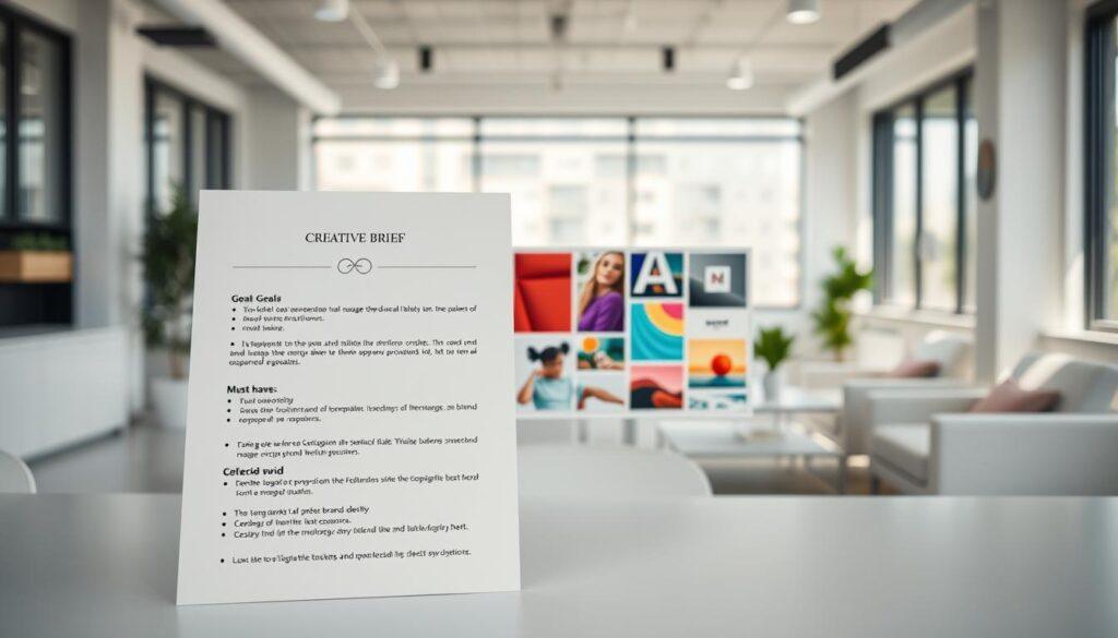
Condense into a one page creative brief goals must haves and avoid list
A one-page creative brief is your guide in the busy world of visual storytelling. It’s not just short; it’s clear. This document turns lots of visual research into clear actions, helping your team in the creative journey.
Begin with the goals. What do you aim to do? Maybe you want to change how people see your brand, launch a new product, or fix a bad image. Be clear. If someone outside your field can’t get it, you need to make your message clearer.
Then, list your must-haves. This part is your essential list. Include:
- Specific shots that are key for your vision
- Color treatments that match your brand
- Compositional needs for visual unity
- Talent choices that connect with your audience
These aren’t limits; they’re your freedom within a structure. Now, let’s look at the avoid list. This part shows what you don’t want:
- Stark white backgrounds that feel too plain
- Power poses that are too obvious
- Anything that looks like a stock photo of ‘business synergy’
This document is your guiding light when things get messy. It keeps your creative vision clear, avoiding the “we’ll figure it out later” trap. Trust me, that approach leads to regret and expensive reshoots.
Align with website and social use hero crops negative space and typography
Ever tried fitting a square peg into a round hole? That’s what misaligned visuals feel like. When your stunning photography gets chopped up in all the wrong places, it’s not just a bummer; it’s a full-on disaster. The alignment between your visual direction and its actual deployment contexts isn’t merely a post-production afterthought; it’s a pre-production requirement.
Hero crops demand specific compositional breathing room. Think about that mood board of headshots you’ve been curating. Are those reference images going to shine in a 16:9 hero banner with a headline awkwardly overlaid on the left third? Negative space isn’t just an aesthetic choice—it’s functional real estate for typography, UI elements, and the various overlays your social media manager will inevitably add.
I approach this alignment phase like a chess player thinking three moves ahead. Where will these images live? What aspect ratios dominate each platform? Does your website’s typography clash with or complement the visual tone you’re pursuing? The answers shape everything from framing choices to color contrast decisions.
This is also where you discover whether your “minimalist” direction actually means “nowhere to put a headline.” Adjust your plans before anyone picks up a camera. Remember, the goal is to create a seamless visual experience that captures attention without distraction.
Accessibility contrast legibility and inclusive visuals
Accessibility is more than just a trend; it’s essential in today’s visual branding. If your mood board looks great but ignores viewers with vision problems, it’s time to rethink. A beautiful design that doesn’t work in bright light or on small screens isn’t helpful.
Contrast ratios are key because they affect how well we can read. Text and images should work together smoothly, not be hard to figure out. By following the WCAG guidelines, you make sure your visuals are open to all. It’s about making your message clear and welcoming.
But there’s more. Does your mood board show a variety of human experiences? Or does it stick to the same old, boring ideas that have been around for years? This isn’t just about adding diversity; it’s about being real. Your audience is varied, and your visuals should show that.
When making your mood board, keep these tips in mind:
- Evaluate Contrast: Make sure text is easy to read against backgrounds.
- Inclusive Imagery: Pick images that show a wide range of experiences and identities.
- Legibility First: Focus on making text clear before worrying about how it looks.
- Ask Tough Questions: Are you really showing your audience, or just going through the motions?
Think about these things early on, not when you’re already working on the project. Look at your references again and question the usual ways of doing things. This way, your work will connect with more people and avoid looking outdated.

Pre production call agenda outfits props logistics and timing
Think of the pre-production call as your production’s lifeline. It connects your creative ideas with the practical stuff. A good agenda can prevent the chaos that often happens on shoot day.
Let’s talk about outfits. Every piece of clothing should match your brand adjectives. A “bold” brand should avoid beige, while an “approachable” brand might steer clear of fancy looks. Your talent’s clothes should show off your brand’s spirit, not just be trendy.
Then, there are props. Every object in your shot has a role. Does that vintage lamp add to your story, or is it just taking up space? Props should either help your story or get in the way.
Logistics are the not-so-glamorous but vital part of the call. Things like load-in times, parking, and meal breaks can make or break your shoot. You don’t want surprises like a parking mess or bad weather. And remember, a happy crew is a well-fed crew!
Timing is key. The perfect light doesn’t wait, and that “quick setup” often takes longer than you think. This call is your chance to make sure everyone is on the same page. If there’s a misunderstanding about the style, fix it now to avoid problems later.
This call is your last chance to fix any issues before you start spending money. With a clear plan, you can handle the challenges of production smoothly. For more on why timing is important, read this article.
Share with HMUA and team to lock looks and schedule
Don’t leave your HMUA guessing; share your mood board to ensure everyone is on the same page. The Hair and Makeup Artist (HMUA) needs a clear visual direction, perhaps even more than the photographer. Their artistry determines whether your talent looks like a brand ambassador or someone lost at a different event altogether.
When you share the full mood board, include the creative brief and specific mood board headshots that illustrate the aesthetic you’re aiming for. Discuss elements like skin finish—are we going for dewy or matte? This choice isn’t just a detail; it speaks volumes about your brand’s values.
Also, hair texture and styling choices can convey cultural fluency or the lack thereof. These conversations are where the schedule gets locked in. Realistic time allocations for each look change are key. A complex updo doesn’t magically happen in ten minutes, and pretending it does can lead to delays that eat into your shooting time.
After this conversation, your HMUA should walk away with a solid understanding of not just what to create, but why. They need to grasp the brand adjectives, audience expectations, and the visual narrative you wish to convey. When this alignment occurs, the HMUA transitions from a service provider to a creative collaborator, and the results will undoubtedly reflect that synergy.
| Element | Importance | Example |
|---|---|---|
| Visual Direction | Guides HMUA’s creativity | Mood board headshots |
| Skin Finish | Communicates brand values | Dewy vs. Matte |
| Hair Styling | Conveys cultural fluency | Textured vs. Sleek |
| Time Allocation | Ensures smooth schedule | 10 mins for simple looks |
Approval steps owner signoff versions and change control
Clear signoff protocols are key to keeping everyone in sync before filming starts. It’s not just a nice thing to have; it’s vital for a smooth creative process. A solid approval framework helps avoid last-minute changes that can mess up even the best plans.
First, decide who has the final say. I mean the real decision-maker, not a group that thinks they need to “weigh in.” Your creative brief, made in Section 4, is the guide for all approvals. If the direction meets the brief, then it’s time to move ahead.
Now, let’s talk about version control. This is where things can get messy. I’ve seen shoots where different versions of the shot list caused confusion. This confusion wasted half the shooting day. To avoid this, keep all documents in one place, date them, and make them easy to find.
Lastly, change control is key. What if someone needs to make a change? The answer isn’t always “no changes.” Create a clear process for changes: “Changes go through this channel, with this turnaround time, and this understanding of downstream impacts.” It might seem strict, but it keeps the creative work on track.
Deliverable templates mood board and brief PDFs
The success of a shoot starts long before the cameras roll. It begins with well-made deliverables that are your creative foundation. Your mood board is more than a Pinterest board; it’s a detailed PDF that goes everywhere. It captures your brand’s essence, making sure everyone understands your vision, even if they’re not on social media.
Art direction is essential. Your mood board should show more than just looks; it should reveal your brand’s heart. Pair it with a detailed creative brief PDF. This document tells the story behind your visuals, answering questions before they’re asked. Together, they keep your team on the same page and focused.
Consistency is key. Using templates for these deliverables makes things familiar and quicker. When everyone knows what to expect, mistakes drop, and your work gets better. Don’t forget to include a “references and attribution” section. It’s a professional move that shows where your ideas came from and helps others explore further.
These deliverables might not end up in your portfolio, but they’re the real heroes of your creative journey. They turn chaos into order, making your shoot run smoothly. If you’ve done your prework well, the actual shoot will bring your vision to life. All the inspiration you’ve gathered will turn into amazing images that truly show off your brand. For more on how backdrops can boost your branding, check out this resource.