
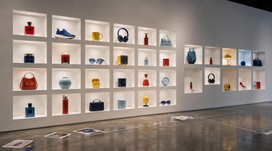
Product photography used to be judged one photograph at a time.
Is the product sharp? Is the lighting attractive? Is the color accurate? Does the composition make the item look appealing?
Those questions still matter. But for ecommerce brands managing dozens, hundreds, or thousands of SKUs, another question is becoming just as important:
What happens when every product photograph looks good individually, but none of them look like they belong together?
That is the catalog-consistency problem.
The issue has become especially visible in 2026 as ecommerce teams combine traditional studio photography, supplier images, freelancer shoots, creator content, automated editing, and AI-generated product scenes. The result can be technically competent imagery with wildly different backgrounds, camera angles, product scales, shadows, color temperatures, crops, and retouching styles.
Recent photography guidance reflects that shift. An August 6 ecommerce photography guide describes catalog production as fundamentally different from a fashion shoot: the challenge is not producing one exceptional photograph but reproducing a complete, consistent image set across every product in the catalog.
Meanwhile, Shopify’s recently updated product photography guide specifically notes that clean white-background photographs create consistency across a catalog, making stores feel more professional and easier to browse.
The lesson is straightforward: once a store becomes large enough, product photography stops being only an image-quality problem and becomes a visual-system problem.
A Good Product Photo Can Still Create a Bad Catalog
Imagine an online skincare store with 40 products.
The first serum was photographed professionally against warm ivory.
The second came from the manufacturer against pure white.
A third was photographed internally on pale gray.
Another was generated against beige marble.
The moisturizer sits low in its frame.
The cleanser almost touches the edges.
One bottle has a hard shadow.
Another appears to float.
Some photographs are warm.
Others are noticeably blue.
Individually, there may be nothing obviously wrong with any of them.
Place all 40 images together on a collection page, however, and the inconsistency becomes much easier to see.
The customer is no longer comparing one photograph against nothing.
They are comparing every photograph against the photographs beside it.
That changes the standard.
The Digital Shelf Makes Inconsistency More Visible
Physical stores naturally provide a degree of visual consistency.
Products stand on the same shelves.
They exist under approximately the same lighting.
Customers view them from the same physical environment.
Ecommerce removes that shared environment.
Each product arrives through an image.
In August 2026, product-imagery company Outshinery described this problem specifically in the beverage sector, arguing that customers often encounter bottles first through a digital listing, distributor portal, marketplace tile, or social-media grid. When lighting, backgrounds, bottle size, and positioning change unpredictably, the visual presentation can weaken perceived cohesion.
The principle extends well beyond beverages.
Shoes.
Cosmetics.
Furniture.
Jewelry.
Electronics.
Handmade goods.
Clothing.
Home accessories.
When products appear side by side, their photographs become part of the interface.
That means consistency affects more than aesthetics.
It affects how easily people can compare products.
Consistency Does Not Mean Making Every Image Identical
There is an important distinction between consistency and repetition.
A catalog does not need 500 nearly identical photographs.
Instead, it needs a shared photographic grammar.
That grammar might specify that every primary image uses:
| Element | Example Catalog Standard |
|---|---|
| Background | Neutral warm white |
| Camera Position | Slightly elevated three-quarter view |
| Product Scale | Approximately equal visual footprint |
| Lighting | Large soft source from camera left |
| Shadow | Natural, soft contact shadow |
| White Balance | Neutral and product-accurate |
| Crop | Consistent aspect ratio and padding |
| Retouching | Clean but physically believable |
Individual products can still have different shapes, colors, textures, and dimensions.
The photography simply gives those differences a stable framework.
Think of typography on a website.
Every headline does not contain the same words, but using consistent typefaces, spacing, hierarchy, and sizing makes the pages feel connected.
Product photography can work the same way.
Product Scale Is One of the Most Overlooked Problems
Consider a collection page showing ten handbags.
If one bag fills 90% of its image while another fills only 55%, the first can appear substantially larger—even if the physical products are similar in size.
The customer now has to mentally correct the photography before comparing the products.
The same issue occurs with bottles.
Shoes.
Jewelry.
Lamps.
Furniture.
Consumer electronics.
Catalog photographers therefore need to distinguish physical scale from visual scale.
Not every product should occupy exactly the same number of pixels. A small clutch and a large travel bag should not be made to look physically identical.
But the relationship should be intentional.
Consistency should help customers understand real differences rather than accidentally creating fake ones. Photography news.
Camera Angle Becomes a Brand Decision
Camera position can dramatically change how an object appears.
Photograph a shoe from low down and it can feel substantial and aggressive.
Photograph it from above and the shape becomes more graphic.
Photograph a bottle straight-on and the label dominates.
Raise the camera slightly and the top becomes visible.
None of these perspectives is inherently correct.
The problem appears when the perspective changes randomly between SKUs.
A professional catalog therefore benefits from defining its primary camera angle before production begins.
That decision can then be documented.
Camera height.
Distance.
Lens.
Product orientation.
Tripod position.
Turntable marks.
All can be standardized.
The goal is repeatability.
Lighting Differences Can Make Materials Look Like Different Products
Lighting consistency matters for more than style.
It affects product information.
A matte surface photographed under broad diffused light behaves differently from the same surface photographed with a small hard source.
Glossy products change even more dramatically.
Glass depends on reflections.
Metal depends on highlight shape.
Fabric depends on directional texture.
Jewelry can change character completely depending on the size and position of its highlights.
Now imagine a jewelry catalog photographed by four photographers using four unrelated lighting setups.
Even if each photographer produces attractive work, the collection can look like it contains products from different companies.
Worse, customers may have difficulty comparing finishes because the lighting itself changes the appearance of those finishes.
White Backgrounds Solve More Problems Than They Appear To
White-background product photography can look simple, but its simplicity is operationally useful.
Shopify’s current guidance describes it as the ecommerce “workhorse” because removing visual noise helps customers evaluate product shape, color, and features while creating consistency across a catalog.
Amazon’s seller guidance makes standardization even more explicit. Its MAIN-image requirements call for the actual product to be clearly represented against a pure white background, with the product filling at least 85% of the frame; additional imagery can then show different angles, details, environments, and use cases.
This produces a useful hierarchy.
The primary photograph can prioritize comparison.
Secondary photography can prioritize explanation and storytelling.
Trying to make every catalog image simultaneously documentary, emotional, promotional, and artistic often creates visual chaos.
The Primary Image Should Establish the System
A useful catalog strategy is to treat the hero image as the visual anchor.
Every SKU gets one standardized primary photograph.
Then secondary images can expand.
For example, a furniture catalog might use a consistent three-quarter product view for every primary image.
Secondary images could show:
room context,
material close-ups,
dimensions,
construction details,
alternative angles,
and styling possibilities.
A fashion retailer might use a standardized front-facing model image followed by movement, back views, close-ups, and lifestyle imagery.
This allows consistency and creativity to coexist.
The catalog grid remains orderly.
Individual product pages become richer.
Secondary Images Should Have Roles Too
Consistency should not end with the hero photograph.
Secondary images benefit from structure.
Instead of randomly uploading whatever photographs happen to exist, brands can define image roles.
For example:
Image 1: standardized hero.
Image 2: alternative angle.
Image 3: detail.
Image 4: scale or dimensions.
Image 5: lifestyle.
Image 6: packaging or included components.
Not every category needs that exact sequence.
The principle is what matters.
A shopper moving between products begins to know where information will appear.
That improves visual navigation.
Amazon similarly recommends supplementing primary imagery with additional photographs showing different sides, the product in use, and features that are not visible in the main image.
Color Accuracy Is Both a Product and Catalog Issue
Color inconsistency can be especially damaging.
Suppose a clothing company sells five shirts in the same navy fabric.
One was photographed under daylight.
One under warm LEDs.
One under flash.
One came from a supplier.
Another was edited by a different retoucher.
The shirts can appear to be five different shades.
Now imagine the reverse problem: five genuinely different blues accidentally look nearly identical because each photograph received different color treatment.
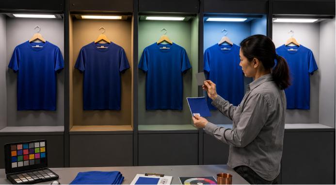
Both situations reduce useful information.
A catalog photography workflow therefore needs consistent color management.
That can involve calibrated displays, controlled lighting, gray references, color targets, consistent export settings, and physical product checks.
The objective is not to make colors prettier.
It is to make them trustworthy.
AI Makes the Consistency Problem More Urgent
Generative AI has dramatically increased the number of images ecommerce teams can produce.
That is useful.
It also increases the number of ways a catalog can become inconsistent.
An August 14 comparison by Rahul Bhargava tested four AI product-photography tools—Crop.photo, Claid, Canva, and Photoroom—using the same ecommerce images. The central challenge identified was not merely whether the systems could create polished images, but whether products remained accurate and outputs consistent enough to sit alongside hundreds of other catalog images.
Small changes become important at that scale.
A background becomes slightly warmer.
The product grows 10%.
The shadow moves.
A reflective surface changes.
Packaging typography shifts.
A chair appears too large for its environment.
The generated image may still look excellent.
But the catalog system has started drifting.
One Prompt Is Not a Photography Standard
A common mistake is assuming that repeatedly entering the same AI prompt will guarantee identical visual treatment.
It does not necessarily work that way.
A recent August 15 batch-production experiment made the problem unusually concrete. Masonry tested a standardized AI workflow across three fictional products using the same background, framing, light direction, output format, seed, and scene instructions. Even with those variables controlled, the authors reported that a single prompt and seed were not enough to produce a completely locked catalog set.
That illustrates the difference between generation and production.
Generation asks:
Can the system create an attractive photograph?
Production asks:
Can we create the 437th photograph using the same visual rules as photograph number one?
The second problem is much harder.
AI Quality Control Should Compare Against the SKU
AI-assisted imagery creates another requirement: product fidelity.
A lifestyle generator might preserve the overall shape of a handbag while subtly changing its clasp.
A shoe may gain an extra seam.
A cosmetic bottle can acquire different typography.
Furniture proportions can shift.
A generated clothing model might wear a garment with altered stitching or pocket placement.
Those errors can be difficult to notice when the generated scene itself is beautiful.
Brands should therefore compare generated imagery against approved product references rather than judging it only on aesthetic quality.
The question is not:
Does this look real?
It is:
Does this look like the real product?
Supplier Photography Creates a Different Version of the Same Problem
AI is not the only cause.
Retailers selling products from multiple manufacturers have faced catalog inconsistency for years.
Supplier A provides white-background photography.
Supplier B provides lifestyle imagery.
Supplier C sends compressed JPEGs.
Supplier D photographs from above.
Supplier E sends PNG cutouts.
Supplier F supplies photographs with visible shadows and warm white balance.
Publishing everything unchanged can make a retailer’s collection page resemble several different websites combined into one.
This is where post-production standardization becomes valuable.
Backgrounds can sometimes be normalized.
Canvas sizes can be standardized.
Product positioning can be adjusted.
Color can be corrected carefully.
But there are limits.
A photograph captured from the wrong perspective cannot always be transformed convincingly into the required perspective.
The best solution remains establishing image requirements before products enter the catalog whenever possible.
A Style Guide Should Include Photography
Many companies have detailed brand guidelines.
They specify exact logo spacing.
Hex colors.
Fonts.
Button styles.
Illustration rules.
Tone of voice.
Then product photography gets one instruction:
“Make it look premium.”
That is not enough for a large catalog.
A product-photography style guide should specify the repeatable characteristics that define the store’s visual system.
For businesses thinking more broadly about photography, presentation, and visual identity, Finest Image provides a useful context for understanding why the technical choices behind an image affect how viewers interpret what they see. Why Kate Spade Turned New York City Into Part of the Product Story?
A catalog guide might document camera perspective, background, product orientation, shadow treatment, crop, padding, color management, resolution, secondary-image sequence, prop limits, lifestyle rules, and retouching boundaries.
Once those decisions are written down, consistency becomes easier to reproduce.
Consistency Has to Survive Different Photographers
Brands grow.
Photographers change.
Studios change.
Agencies change.
Products may be photographed in New York this month and Los Angeles next year.
A useful photography standard should survive those changes.
That means documenting measurable characteristics rather than relying only on aesthetic language.
“Clean and modern” is subjective.
“Soft light from approximately 45 degrees camera-left with a neutral white background and visible contact shadow” is more reproducible.
“Make the product prominent” is vague.
“Maintain consistent visual padding across equivalent SKUs” is actionable.
The more a catalog grows, the more valuable those distinctions become.

Tethered Shooting Can Catch Problems Before They Multiply
Large catalog shoots create another danger: repeating a mistake hundreds of times.
Imagine photographing 150 products before realizing the camera moved slightly after product number 12.
Or discovering afterward that the background became darker throughout the afternoon.
Or learning that a product category was framed too tightly for the website’s crop.
A recent August 22, 2026 catalog-production workflow from New York-based Love Studios emphasized this operational side of the problem. For shoots involving 100 or more SKUs in a day, it recommends standardizing image requirements, organizing products into batches, locking the studio setup, shooting tethered, conducting quality control during production, and keeping files associated with the correct SKU.
This is less glamorous than lighting a hero advertisement.
It is also exactly what makes large catalogs work.
File Management Is Part of Image Consistency
Catalog consistency is not purely visual.
It is operational.
Every photograph has to remain connected to the correct product.
That means filenames matter.
SKU mapping matters.
Variant identification matters.
Version control matters.
Approval status matters.
Suppose a retailer sells the same shoe in 12 colors.
If the retouched burgundy photograph accidentally gets associated with the red SKU, perfect photography does not help.
As catalogs grow, product imaging increasingly overlaps with digital asset management.
The image needs to be beautiful.
It also needs to be identifiable.
Mobile Shopping Makes Scale Differences More Noticeable
Desktop screens provide generous space.
Phones do not.
On a small collection grid, subtle inconsistencies can become exaggerated.
One product appears tiny.
Another fills the tile.
One has a dark background.
The next is bright white.
One image has significant empty space.
Another is cropped tightly.
The result can make scrolling visually uncomfortable.
This is another reason to review catalog imagery in context rather than only on a calibrated studio monitor.
Photographers and ecommerce teams should inspect actual collection pages.
Desktop.
Tablet.
Phone.
Search results.
Marketplace grids.
Email.
A photograph can be technically excellent at full resolution and still perform poorly inside the interface where customers encounter it.

Cropping Should Be Planned Before the Photoshoot
Etsy’s current product photography checklist recommends creating photographs that can survive multiple crops and aspect ratios because listing images may appear across different parts of the platform. It also cautions against filters that alter how product colors appear.
That principle is useful beyond Etsy.
A master photograph may eventually appear as:
square,
portrait,
landscape,
thumbnail,
search tile,
email card,
mobile product image,
or social advertisement.
Photographing with enough intentional negative space gives the image flexibility.
Cropping every product differently after the fact can destroy catalog alignment.
Lifestyle Photography Needs Consistency Too
The solution is not to make every lifestyle image identical.
Lifestyle photography exists partly to create variety.
But even varied environments can share a visual identity.
A home-goods company might define:
natural daylight,
warm architectural materials,
muted colors,
real residential environments,
restrained props,
and eye-level camera positions.
One photograph could be in a kitchen.
Another in a bedroom.
Another outdoors.
They still feel related.
This is similar to the way a film can move between different locations without suddenly looking as if a different production created every scene.
The photographic language connects them.
Consistency Should Never Override Product Truth
There is an important limit.
A catalog should not force every product into identical treatment when doing so makes the product harder to understand.
A transparent glass needs different lighting from a cotton T-shirt.
Jewelry needs different techniques from furniture.
Black products may require separation that white products do not.
Reflective metal requires controlled highlights.
Very small products need different framing from large objects.
Consistency should therefore operate at the level of visual principles, not blindly identical technical settings.
The goal is coherence without sacrificing accuracy.
The Best Catalog Is Predictable in the Right Ways
Customers should not be surprised by the photography system.
They should be surprised by the products.
When someone opens a collection page, they should quickly understand how to read it.
Products occupy comparable space.
Angles make sense.
Colors appear believable.
Backgrounds belong together.
Secondary photographs answer predictable questions.
Lifestyle imagery feels connected to the brand.
Details appear where customers expect them.
That visual predictability reduces unnecessary cognitive work.
Instead of figuring out the photography, customers can evaluate the merchandise.
Product Photography Is Becoming Infrastructure
The most important shift is conceptual.
For a small store with six products, photography can remain a collection of individual creative decisions.
At 60 products, patterns begin to matter.
At 600 products, those patterns become a system.
At 6,000 products, they become infrastructure.
That is why catalog photography increasingly involves art direction, production standards, color management, asset organization, templates, quality control, and automation alongside cameras and lighting.
AI makes this transformation more visible because it dramatically increases production capacity. But the underlying challenge existed before generative tools arrived.
The easier it becomes to produce another product image, the more important it becomes to know exactly what that image is supposed to look like.
The brands that solve this problem will not necessarily have the most dramatic photographs.
They will have something harder to maintain at scale: hundreds or thousands of photographs that remain accurate individually while clearly belonging to the same visual world collectively.