

A handbag can be photographed almost anywhere.
Place it on a seamless background, light it carefully, show the hardware and leather clearly, and the resulting image can do an excellent job of documenting the product. But product documentation and brand storytelling are not the same thing.
Kate Spade New York’s Fall 2026 campaign demonstrates the difference.
Launched on August 11, 2026, the campaign introduces two-time Grammy-winning artist Tyla as a new global brand ambassador and turns New York City itself into a playful search for everyday joy. The campaign also includes creator and entrepreneur Bretman Rock, Dylan Kevitch, Nick Kosir, Kareem Rahma, Julia Mervis, Payton Purther, Sally Carden, the 4inthe5 creator collective, Gianluca Conte of QCP, and Ana Sofia.
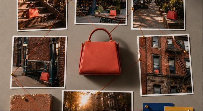
The product at the center is the Duo Mini shoulder bag, presented in seasonal treatments including Beet, Laurel Leaf, Smokey Petal, Driftwood, Pomegranate and other variations. Yet the bag is not simply isolated and photographed as an object. It becomes part of an urban narrative built around discovery, movement, personality, and New York’s visual energy.
That choice provides a useful lesson far beyond fashion advertising.
A location can do more than provide a background for product photography. When the environment aligns with the identity of the brand, it can become part of what the product means.
Kate Spade Made the City Part of the Campaign
The Fall 2026 campaign does not treat New York as an anonymous collection of attractive streets.
The brand describes the campaign as a citywide game of hide-and-seek in which unexpected discoveries appear throughout New York. The hero film was directed by Rupert Sanders, while campaign photography is credited to Grant James, with behind-the-scenes photography by Marcus Gustaffson. Creative agency Marcel and production house Wanda also worked on the campaign.
That creative structure matters.
New York is not simply behind the talent.
It gives the campaign its logic.
People move through the city looking for moments that might otherwise go unnoticed. The product travels through that environment with them. Streets, architecture, movement, personalities and objects all contribute to the idea of discovery.
For product photographers, this is an important distinction.
There is a major visual difference between putting a handbag on a city street and using the city to explain what the handbag’s brand represents.
The first is location photography.
The second is environmental brand storytelling.
The Duo Mini Has a Role Rather Than Just a Placement
One reason the concept works is that the Duo Mini is not merely inserted into the imagery as a mandatory product shot.
Kate Spade describes the bag as both a catalyst for discovery and a symbol of curiosity within the campaign.
That gives the product a narrative function.
This is a useful principle for lifestyle product photography.
Instead of asking only, “Where can we put this product?” photographers and creative directors can ask:
What is the product doing in this environment?
A travel bag photographed beside a train communicates movement.
A coffee cup beside an open notebook and morning window communicates routine.
A pair of running shoes beside a wet park path suggests actual use.
A structured work bag moving through a busy downtown environment can suggest mobility and professional life.
The surroundings provide context that a white-background photograph cannot.
That does not make clean product photography obsolete. It means the two image types perform different jobs.
A White Background Explains the Product
There is a good reason ecommerce sites still rely heavily on controlled product photographs.
Clean photography removes distractions.
It can show silhouette, material, construction, hardware, color and proportion. Multiple angles can document what the customer will actually receive.
That is essential.
A beautifully photographed street scene cannot replace a clear image of a handbag’s interior compartments if those compartments matter to the purchase.
The same applies to clothing, shoes, jewelry and accessories.
Lifestyle photography should therefore add meaning rather than hide missing product information.
The strongest commercial image systems usually combine the two.
Catalog photography tells customers what the object is. Lifestyle photography helps them imagine what owning it might feel like.
New York Supplies Visual Information Before Anyone Reads the Copy
Location photography communicates surprisingly quickly.
Viewers notice architecture.
Street width.
Transportation.
Weather.
Crowds.
Light.
Building materials.
Storefronts.
Movement.
Clothing.
Even the pace implied by the photograph can influence perception.
A handbag photographed in a quiet country house creates one association.
The same handbag photographed during an active New York afternoon creates another.
Neither is automatically better.
The question is which environment corresponds to the brand.
For Kate Spade, New York has unusually strong relevance. The company was founded in New York in 1993 and continues to use “New York” in its brand identity. Its own corporate description emphasizes color, playful sophistication, optimism and unexpected details.
The Fall 2026 campaign therefore does not need to invent an arbitrary relationship with the city.
It can build on an existing one.
Brand Locations Work Best When They Are Credible
This is where smaller companies can learn something useful without copying Kate Spade’s campaign.
A brand does not need Manhattan.
It needs an environment that makes sense.
Imagine a small ceramics company based in Santa Fe.
Photographing its products in a generic luxury penthouse might produce attractive pictures. But locally relevant architecture, desert light, natural materials and regional colors could create a much more distinctive visual identity—provided those choices genuinely relate to the business.
A surf brand in San Diego has another visual vocabulary.
A heritage clothing company in Boston has another.
A contemporary furniture maker in Portland may have another.
Even a neighborhood can become recognizable.
The important factor is not fame.
It is specificity.
Generic environments produce generic associations.
Specific environments can accumulate meaning.
The City Can Function Like a Brand Color
Most companies understand the value of repeated colors.
A particular red, green or blue appears across packaging, websites, advertisements and retail environments until audiences begin associating it with the company.
Locations can operate similarly.
Repeated architectural materials, types of streets, natural environments, interior spaces and lighting conditions can become part of a visual system.
A company might repeatedly photograph products against:
weathered coastal architecture,
dense urban streets,
minimal concrete interiors,
sunlit residential kitchens,
historic brick buildings,
or open desert landscapes.
Over time, those surroundings become recognizable.
The viewer may not consciously think, “This brand always uses warm limestone architecture.”
They may simply recognize the image as belonging to that brand.
That is the goal.
Photography Creates Brand Memory Through Repetition
One excellent photograph can attract attention.
A recognizable photographic system can build memory.
This distinction becomes increasingly important as brands create more visual content.
Campaigns now have to work across ecommerce pages, social feeds, email, vertical video, paid advertising, digital displays and physical retail.
If every image uses completely unrelated lighting, color, composition and environments, the brand can disappear inside its own content.
The solution is not to make every photograph identical.
It is to establish recurring visual characteristics.
Kate Spade’s Fall 2026 campaign connects different personalities through a larger concept of joy, discovery and New York. Tyla does not need to look identical to Bretman Rock for the campaign to feel connected.
The system provides coherence.
The Talent Also Changes How the Product Is Read
The campaign’s casting is another part of its visual strategy.
Tyla, Bretman Rock, Kareem Rahma, Julia Mervis and the other participants come from different areas of contemporary culture, including music, fashion, food, comedy and online media. Kate Spade explicitly describes this diversity as representing different expressions of joy.
For photographers, this illustrates another important point.
The person holding a product is not a neutral display stand.
Talent changes interpretation.
A bag photographed on a business executive may feel different from the same bag carried by a musician.
A sneaker photographed on a competitive runner communicates differently from the same shoe photographed on a fashion stylist.
A camera photographed with a wildlife photographer creates different expectations from one photographed with a parent documenting a birthday.
The object remains physically identical.
The story changes.
Product Photography Should Show Relationships
One of the easiest ways to improve lifestyle product imagery is to think about relationships rather than props.
A weak setup might begin:
“We need a handbag photograph. Put a coffee cup, flowers and sunglasses beside it.”
Those objects may look attractive, but they do not necessarily tell us anything.
A stronger question is:
What relationship exists between the person, product and environment?
Is the person arriving somewhere?
Leaving somewhere?
Searching for something?
Meeting someone?
Carrying something?
Using the object?
Packing it?
Opening it?
The action does not need to be dramatic.
Small believable behaviors create context.
Kate Spade’s hide-and-seek concept is a particularly explicit version of this technique because the campaign gives the characters a reason to interact with their environment.
Movement Makes Accessories Easier to Understand
Fashion accessories often benefit from movement.
A studio photograph can show the precise shape of a bag.
A walking photograph can reveal something else.
How does it sit against the body?
Where does the strap fall?
What happens to its silhouette while moving?
Does it feel compact or substantial?
How does its color interact with clothing?
Those details contribute to perception even when the image is primarily emotional.
The same principle applies to apparel.
A dress hanging perfectly on a mannequin provides useful information.
A dress photographed while someone walks reveals drape.
Shoes photographed from above show design.
Shoes photographed during movement communicate proportion and use.
Lifestyle photography becomes valuable when it adds visual information rather than merely decorating the product.
Street Photography Can Make Commercial Images Feel Less Controlled
Brands often want commercial photography to feel spontaneous.
That is difficult because commercial photography is inherently planned.
The location is selected.
The talent is cast.
Wardrobe is styled.
Products are chosen.
Lighting is controlled or anticipated.
Photographers and directors know what needs to be delivered.
Yet the finished photograph may need to feel like an unexpected moment.
Urban environments can help create that impression because cities contain visual unpredictability: changing pedestrians, reflections, traffic, signage, shadows, architecture and movement.
The challenge is maintaining control without removing that energy.
Too much control and the city becomes a decorative movie set.
Too little control and the product disappears.
Strong environmental commercial photography sits between those extremes.
Product Visibility Still Has to Survive the Environment
A beautiful location can become a problem when it competes with the object being sold.
New York provides enormous visual density.
Buildings, taxis, people, street furniture, windows, pavement markings and advertising can all demand attention.
Product photographers therefore have to create hierarchy.
Contrast can help.
So can depth of field.
Lighting can separate the product.
Camera position can place it against a relatively simple section of the environment.
Wardrobe colors can support rather than compete with it.
Movement can direct attention toward it.
The product does not necessarily need to occupy half the frame.
It simply needs to remain visually legible.
Color Can Connect Product and Place
Kate Spade’s brand identity has long made color important, and the Fall 2026 Duo Mini appears in numerous seasonal colorways.
Environmental photography creates an opportunity to use those colors relationally.
A green bag can echo foliage.
A burgundy accessory can contrast against gray stone.
A pink product can become more prominent against subdued architecture.
A metallic finish can interact with nighttime reflections.
This is where location scouting and product photography intersect.
The photographer should not merely find a beautiful street.
They should find a street that helps the product photograph well.
The best location may therefore be visually quieter than the most famous one.
You Do Not Need a Landmark
This is especially relevant for small brands.
Using New York does not mean every image needs the Empire State Building, Times Square or Brooklyn Bridge.
In fact, obvious landmarks can overwhelm products and make commercial photography feel tourist-oriented.
A city can be communicated through smaller details:
brownstone steps,
subway entrances,
corner cafés,
crosswalks,
brick walls,
park benches,
apartment windows,
sidewalk textures,
street trees,
and recognizable patterns of urban light.
These details often produce more believable lifestyle imagery.
They also leave more room for the product.
Local Businesses Have an Advantage Here
Independent businesses can use environmental specificity more naturally than they may realize.
A small bakery can photograph packaging on the actual neighborhood streets where customers carry it.
A handmade jewelry company can use the architecture surrounding its studio.
A clothing company can photograph customers in places connected to the community it serves.
A bicycle-accessory company can use real local routes.
These environments do not need to pretend that the brand is global.
Local identity can be the differentiator.
That is particularly useful when competitors are using interchangeable AI-generated interiors or generic stock environments.
A real location can contain imperfections that make the photograph harder to replicate.
The Environment Should Not Misrepresent the Product
Lifestyle storytelling still requires accuracy.
A product should not be photographed in a way that suggests capabilities it does not have.
An electronic device without meaningful water resistance should not casually appear operating in heavy rain.
A delicate handbag should not be photographed in a context implying rugged outdoor performance unless that use is credible.
Food-adjacent imagery should not imply safety claims the product cannot support.
The environment creates associations, and associations can become product claims even without written text.
That makes location selection part of responsible commercial photography.
A Campaign Needs Both Wide and Tight Images
When the environment matters, photographers should capture it deliberately.
A wide photograph establishes place.
A medium composition establishes the relationship between person and product.
A tight image restores attention to material, hardware, texture or detail.
That creates a visual sequence.
For a handbag campaign, for example:
a wide frame could establish the street,
a medium photograph could show someone carrying the bag through that street,
and a tight image could show the bag against the person’s clothing.
The environment becomes progressively less important as product information increases.
Brands then have multiple assets rather than trying to make one photograph perform every task.
Real Locations Also Introduce Real Production Problems
Environmental campaigns are not automatically easier than studio shoots.
Cities introduce changing weather.
Pedestrian traffic.
Reflections.
Permits.
Vehicles.
Noise.
Uncontrolled signage.
Changing sunlight.
Crowds.
Security.
Background people.
Commercial photographers have to manage those variables while maintaining continuity across a campaign.
That is part of why a location needs to provide enough visual value to justify the complexity.
A plain studio is controllable.
A real street is not.
The street should therefore contribute something meaningful.
New York Gives Kate Spade More Than Scenery
The most useful way to understand the Fall 2026 campaign is that New York performs several jobs simultaneously.
It connects with the brand’s identity.
It provides movement.
It creates opportunities for discovery.
It accommodates a culturally varied cast.
It gives the Duo Mini a reason to travel through different situations.
And it reinforces the campaign’s central idea that interesting moments can be found inside ordinary surroundings.
CEO and Brand President Eva Erdmann described the campaign as an invitation to pay closer attention to small moments of joy rather than waiting for something extraordinary. That language is consistent with Kate Spade’s broader emphasis on optimism, color and emotional connection.
The city therefore does not merely make the campaign look more expensive.
It helps explain the message.
The Lesson for Product Photographers Is to Choose Places With a Job
For brands and photographers, the strongest takeaway is not “shoot products in New York.”
It is to stop treating locations as decoration.
Before choosing an environment, ask what it contributes.
Does it establish who uses the product?
Does it communicate when the product is used?
Does it reinforce the company’s history?
Does it provide useful color contrast?
Does it reveal scale?
Does it demonstrate movement?
Does it strengthen the brand personality?
Does it make the product easier to imagine in real life?
If the location contributes nothing beyond visual attractiveness, a simpler environment may produce a stronger photograph.
This principle fits naturally with the broader photography and visual-presentation focus at Finest Image: good imagery is not merely about making a subject attractive. Composition, setting, lighting and context all influence what viewers believe an image is communicating.
The Product Story Can Extend Beyond the Product
Kate Spade’s Fall 2026 campaign ultimately demonstrates why environmental photography remains valuable even as brands gain access to increasingly sophisticated studio, compositing and AI-generated imagery.
The Duo Mini can be photographed perfectly against white.
That image can show shoppers what the bag looks like.
But the Fall 2026 Kate Spade campaign asks the product to perform another job: participate in a story about curiosity, personalities and small moments of discovery across New York.

Kate Spade’s broader social impact and brand report also describes authenticity, belonging, positivity and intentionality as values expressed across its product and physical and digital spaces. That makes the environment around the product more than an arbitrary campaign choice.
And the July 30 announcement naming Tyla as Kate Spade’s global brand ambassador preceded the Fall campaign by less than two weeks, giving the August launch a clear talent-and-brand context.
For photographers, that is the larger opportunity.
A product photograph can document an object.
A carefully chosen location can document a relationship between the object, the person carrying it and the world the brand wants audiences to imagine.
When those three elements reinforce one another, the background stops being background.
It becomes part of the product story.