

In today’s digital world, your business card is like a real-life handshake. It says “I’m actually here.” It’s a small piece of you that stands out from digital clutter.
Why put your face on it? Because in the age of social media, your photo is your brand. It’s not just about looks—it’s about being real. A photo helps you connect with people right away at networking events.
Business cards are easy to carry and share. They help people find you online. For creative folks, your photo shows off your style and makes your brand unforgettable. It’s like a mini portfolio that fits in your pocket.
Using cards without photos is like showing up to a big event with just a PowerPoint. Your first impression matters a lot more than that.
Choosing the Right Shot
Your business card photo is like a movie trailer. It should grab your attention and make you want more. This small piece of paper is powerful in making a good first impression. Get it right, and you’ll be remembered; get it wrong, and you’ll blend in with the crowd.
High-contrast photos are like a strong coffee. They grab your attention quickly. When your photo is shrunk down, soft colors and details disappear. Bold subjects against clean backgrounds are your best bet.
You’re not aiming for a photography award. You’re aiming to attract clients. A photo of a bride laughing is great for wedding photographers. A corporate headshot that shows competence is perfect for consultants.
Stay away from the Myspace-style selfies. Your business card is not for personal use. It’s for showing your professional side. Choose big, bold, and unmistakably you.
| Photo Element | What Works | What Doesn’t |
|---|---|---|
| Contrast Level | High contrast, clear separation | Subtle gradients, muted tones |
| Subject Size | Large, in-focus main subject | Small subjects, busy backgrounds |
| Background | Clean, simple, non-distracting | Complex patterns, competing elements |
| Professional Vibe | Authentic but polished | Overly casual or trying too hard |
| Color Scheme | Bold, recognizable colors | Faint colors that fade when printed |
The right business card photo is like a visual elevator pitch. It should show you’re professional and approachable. Think of it as your professional Tinder profile. You want to intrigue and be authentic.
Your photo needs to stand out at business card size while showing your brand. It’s a balance between being noticed and fitting in. Get this right, and your business cards become powerful tools, not just paper.
Positioning and Sizing
Think of your business card as a tiny stage. Every element should get its moment in the spotlight. Your photo should support the lead, not steal the show.

Size is key. A photo that’s too big can block important info. Too small, and it’s hard to find you. Aim for a size that’s noticeable but not too big, about 25-30% of the card.
Positioning is about where your eye goes first. Put your photo to guide attention from your logo to your name and contact info. This creates a flow that makes a strong first impression before you even meet.
Don’t underestimate white space. It’s what lets your info stand out. If your photo pushes your website aside, you’ve missed the point. Your face should enhance your credentials, not fight them.
The best spot for your photo? Usually the upper left or right corner. This balance makes your card memorable and useful.
Printing Best Practices
Think of your business card as the opening act of your professional story. The paper stock is your stage. The ink is your lighting. Get these wrong, and your networking might feel like a dimly lit basement bar.
Paper thickness is key. Choose 14 pt. Gloss Paper for a shiny look, or 16 pt. Premium Matte Paper for a more subtle feel. The difference is not just in feel but also in how it makes you feel.
High-resolution printing with UV ink is essential. It brings out rich colors and crisp lines, showing you’re professional, not just printing at home.
Let’s look at the finish options:
| Finish Type | Visual Impact | Tactile Feel | Best For |
|---|---|---|---|
| Glossy | Premium, eye-catching | Smooth, reflective | Creative industries, luxury brands |
| Matte | Sophisticated, subtle | Soft, approachable | Consulting, professional services |
| UV Coated | Vibrant, protected | Durable, premium | All industries (highly recommended) |
UV coating is often overlooked but it’s a game-changer. It makes colors pop and protects your card from fading and smudging. This is key for business cards that get handled a lot.
Choosing between glossy and matte says a lot before anyone reads your card. Glossy says “I’m premium!” while matte says “I’m sophisticated but down-to-earth.” Pick a finish that matches your brand’s personality. If your card feels cheap, people might think your work is too.
Remember, proper business card design rules go beyond looks to quality. The right paper and finish can make your card unforgettable in any networking setting.
Your card is often the first thing people touch in professional networking. Make it count with quality that shows your standards. In the world of business cards, feeling is believing.
Design Tips
Think of your business card as a tiny art gallery. Every element must earn its spot. Your font choice is key for readability, not just looks. Choose clean fonts like Arial or Helvetica. Comic Sans is for kids’ art, not business cards.
Color psychology is important. Your colors should reflect your brand’s personality. If you’re a vibrant event photographer, go bold. A minimalist artist should keep it sleek. Being consistent across all touchpoints helps clients remember your brand.
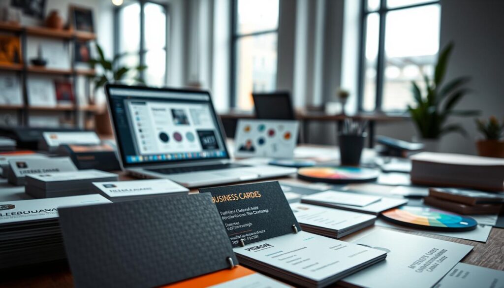
Thematic elements can add interest. Use camera icons or film strip motifs sparingly. But don’t forget, white space is your friend. Let your design breathe.
Here’s how different design approaches stack up for various professional needs:
| Design Approach | Best For | Visual Impact | Brand Alignment |
|---|---|---|---|
| Minimalist Design | Corporate Professionals | Clean & Professional | High-End Services |
| Bold Color Blocks | Creative Industries | Memorable & Energetic | Youthful Brands |
| Thematic Elements | Photography/Art Fields | Industry-Specific | Niche Specialists |
| Mixed Typography | Design Studios | Modern & Dynamic | Innovative Companies |
Your business card is often the first impression with clients. Design with purpose, not just defaulting to templates. In a digital world, a well-made physical card stands out like a vinyl record in a Spotify playlist.
Do’s & Don’ts
Let’s play a quick game of professional truth or dare with your business card photo. In the world of networking, your card is more than paper. It’s a tiny ambassador for your personal brand.
Do make your name the headline act. It shouldn’t be hard to figure out who you are. Include phone, email, and website details. Think of it as your professional bat-signal.
Do use a high-resolution image that actually represents your niche. A chef? Wear your whites. Architect? Hard hat optional but encouraged. Your photo should hint at your profession before you speak.
Do embrace QR codes like they’re the second coming of the business card. Scanning is the new handshake. Nobody wants to type URLs anymore.
Now for the don’ts. Don’t use a photo that looks like it was taken during a blackout. Low-light shots are bad for first impressions. If we need night vision goggles to see your face, it’s a problem.
Don’t create a collage of your entire life story. This isn’t your grandma’s refrigerator door. One clear, professional image is better than twenty confusing ones.
Don’t forget your logo. It’s the visual handshake that completes your brand identity. And for the love of all that’s holy, don’t use that photo where you’re squinting like you just witnessed the birth of a star.
Remember: your business card is often the first physical touchpoint in networking. Make it count without making it complicated.
Real Examples
Let’s dive into real business cards that made a splash at networking events. These cards aren’t just for show—they’re tools that turn chance meetings into chances for growth.
Norris Mantooth’s event photographer card is a masterpiece of design. The camera lens cutout is more than a gimmick; it’s a clever branding move. It lets people see his contact info through a lens, making his marketing feel very personal.
Jelle Akkerman’s card is a perfect example of how to show off your skills without getting mixed up. It combines photos and clean design to say, “I’m good at both.” It’s like a handshake that introduces you to your artistic and technical sides at once.
VistaPrint’s minimalist designs show that sometimes, less is more. These cards use white space to let your professional image stand out. The quietest card can often make the biggest impression.
| Designer | Key Feature | Networking Impact | Why It Works |
|---|---|---|---|
| Norris Mantooth | Camera lens cutout | High memorability | Thematic without being kitschy |
| Jelle Akkerman | Photo/design fusion | Dual expertise showcase | Balances creativity and professionalism |
| VistaPrint Minimalist | Clean typography | Sophisticated impression | Proves less can be more effective |
These examples have one thing in common: they know their audience and show their personality. The best business cards don’t just share your contact info; they tell a story about how you solve problems. So, take inspiration, but make it your own.
Conclusion
In today’s digital world, your business card stands out. It’s not just paper; it’s a powerful tool for making a lasting first impression. It acts as your personal ambassador, even when you’re moving on to other conversations.
A photo on your business card turns it into a mini-portfolio. It shows professionalism and approachability. When someone finds your card later, your face sparks recognition, something text can’t do.
This isn’t about looking good; it’s about smart networking. In a sea of forgettable cards, yours will stand out. As this analysis of headshots on business cards shows, the impact is clear. You’re not just sharing contact info; you’re making a mark.
Your business card with a photo is like a bookmark in someone’s memory. It’s the handshake that keeps going long after the event is over. Now, make your business card count.