

Think of the most iconic portraits. Often, the subject is alone against a simple, unadorned background. This choice is not random. In a world full of visual noise, a minimalist backdrop is not empty; it’s a powerful, calculated void.
It’s like a perfectly tailored black suit. It doesn’t draw attention; it frames. It’s the difference between F. Scott Fitzgerald’s clean prose and a Victorian novel’s dense descriptions. Your brand’s visual identity should be as clear.
Modern, minimalist backdrops—like seamless paper or a smoothly painted surface—create a sleek, clean stage. They don’t whisper; they command attention by eliminating competition. The focus snaps to the subject: the sharpness of a gaze, the confidence in a posture. This is the aesthetic of precision. It signals a brand that is confident, clear, and uncluttered.
But is the clean slate always the right canvas for your brand story? The choice between a textured and a minimalist backdrop for headshots is more than aesthetic; it’s a strategic brand statement.
Key Takeaways
- A minimalist backdrop frames your subject with precision, eliminating distraction and placing all focus on the individual.
- This aesthetic projects a brand identity of clarity, confidence, and modern sophistication.
- The choice between a textured and minimalist backdrop is a strategic brand decision, not just a visual one.
Textured Options: Canvas, plaster, wood, and fabric and what they signal
Let’s be honest. While the seamless paper backdrop is reliable, it’s also a bit boring. It’s like elevator music. For product photography that needs to show quality, heritage, or artisanal craft, you need texture.
Texture adds depth, history, and authenticity that a flat color can’t. It’s the difference between a headshot and a portrait, a product and a story.
Choosing a textured backdrop isn’t just about looks; it’s a form of semiotics. Each texture sends a distinct signal. Let’s break down the character actors of the textured world.
Canvas: The Painterly Touch
Canvas is the method actor of backdrops. It has a visible weave and subtle tooth, whispering of the artist’s studio. It’s not just a background; it’s a painterly surface.
It suggests craftsmanship and a human touch, making it perfect for artisanal goods. It provides a subtle, organic grain that adds warmth without overpowering the subject.
Plaster: The Minimalist’s Statement
For the minimalist, textured plaster is your concrete poetry. It’s the backdrop that says “curated” and “considered.” It provides a subtle, organic texture that feels both modern and ancient.
It’s perfect for high-end tech, modern ceramics, or any product that wants to communicate a sense of wabi-sabi and quiet luxury.
Reclaimed Wood: The Rustic Storyteller
This is texture with a narrative. Each knot, grain, and weathered groove tells a story of age and use. It screams authenticity.
A reclaimed wood panel whispers “artisanal,” “heritage,” and “craft.” It’s the go-to for organic products, artisanal foods, or any brand wanting to tap into the farm-to-table, slow-living aesthetic.
Luxury Fabric: The Tactile Statement
Think velvet, raw silk, or a heavy linen. Fabric backdrops are the velvet rope of the photography world. They signal luxury, softness, and a tactile experience.
A deep green velvet becomes a sumptuous bed for jewelry, while raw silk provides a soft, organic shimmer. This is texture as an experience of the senses, inviting the viewer to imagine the feel of the backdrop itself.
| Material | Vibe & Semiotic Signal | Best For Product Types | Pro Tip |
|---|---|---|---|
| Canvas | Artistic, handmade, authentic, atelier-crafted. | Artisan goods, craft beverages, artisanal foods, pottery. | Use side-lighting to make the weave pop and add depth. |
| Plaster | Minimalist, modern, architectural, serene. | Tech products, ceramics, modern jewelry, minimalist fashion. | Use a softbox to avoid harsh shadows on the textured surface. |
| Reclaimed Wood | Rustic, heritage, authentic, storied. | Craft spirits, leather goods, heritage brands, artisanal tools. | Ensure the wood grain is clean and free of distracting blemishes. |
| Luxury Fabric | Luxury, tactile, intimate, high-end. | Jewelry, perfume, high-end cosmetics, luxury textiles. | Use a steamer to remove any wrinkles before the shoot. |
So, the next time you reach for that reliable roll of seamless paper, pause. Ask yourself: could texture tell a better story? A painted canvas whispers of the artist’s studio, rough-hewn wood speaks of heritage, and plaster echoes with minimalist intent.
They are not just backgrounds; they are co-stars in your product’s visual narrative. They offer a richness and depth that no flat color can match.
When Texture Helps: Differentiation without distraction
In a world of flat, sterile stock photos, a textured background is like a well-timed pause in a speech. It creates space. It adds weight. It tells the viewer there’s a story here, a depth beyond the surface. But the line between a textured background that grounds your subject and one that swallows it whole is thinner than a fresh coat of primer.
Texture is your secret weapon for adding character without saying a word. A painted canvas backdrop, for instance, doesn’t just hang there. It whispers of a process, of the artist’s hand, of something crafted. The data backs this up: textured materials are excellent at concealing imperfections and, more importantly, they add a tangible warmth and dimension that flat colors can’t. A recent study on design perception found that textured backdrops increased viewer engagement by suggesting authenticity and depth.
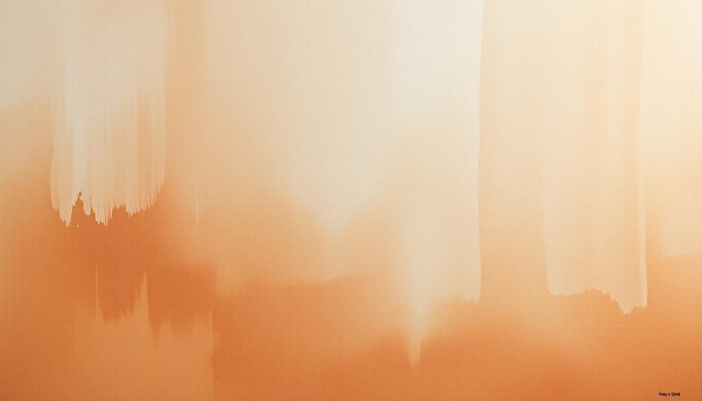
So when does texture move from being a smart choice to the only thing people notice? The answer is intentionality. A headshot for a master carpenter against a subtle, grain-matched wood texture doesn’t just fill space—it authenticates. It’s a credential. For a creative director, a softly textured plaster wall in the background doesn’t scream for attention; it whispers “maker” and “thinker.” The texture becomes part of the subject’s story, not a distraction from it.
But the line is fine. A texture that’s too busy or high-contrast doesn’t frame your subject—it kidnaps it. The goal is the visual equivalent of a perfect soundtrack: it sets the mood without drowning out the dialogue.
| Texture Type | What It Signals | Ideal For | Pitfall to Avoid |
|---|---|---|---|
| Canvas (Painted) | Artistic, crafted, human touch. Adds a painterly, organic feel. | Portraits of artists, creatives, and brands wanting an “atelier” vibe. | Overly heavy brushstrokes can look chaotic. Opt for subtlety. |
| Plaster/Wall Texture | Urban, raw, authentic. Suggests a grounded, no-nonsense feel. | Architects, entrepreneurs, and brands built on grit and realness. | Can look grungy if lighting is flat. Needs directional light. |
| Wood (Weathered) | Warm, organic, established. Suggests heritage and craftsmanship. | Artisans, carpenters, heritage brands, and “maker” brands. | Can feel rustic or clichéd if the wood tone is too orange or fake. |
| Fabric/Textile | Luxury, softness, approachability. Velvet or linen adds tactile luxury. | Fashion, lifestyle brands, and portraits where warmth is key. | Wrinkles or poor fabric choice can look cheap or distracting. |
The key is to think of texture as a supporting actor, not the star. A textured painted canvas backdrop, for example, adds a layer of tactile, human-made character that a flat, seamless paper roll never could. It suggests the subject is part of a story, not just a sterile product shot. It’s the difference between a headshot and a portrait.
So, before you default to a flat grey sweep, ask: what is the unspoken quality of my subject? A rugged, textured background can say “reliable” and “authentic,” while a smooth, seamless one might say “corporate” and “polished.” The right texture is a whisper of context, not a shout. And in a world of loud visuals, sometimes the quietest backdrop makes the loudest statement.
Retouching and Moiré Considerations
You’ve picked the perfect canvas for your portrait. The shot looks great, and the lighting is perfect. But then, you see it: a shimmering, wavy pattern that wasn’t there before. Congratulations, you’ve encountered the moiré effect, a common problem in high-detail photos.
This digital issue happens when a patterned texture clashes with your camera’s sensor grid. It creates a new, often distracting pattern that’s hard to edit.
A “smooth” background is more than just clean. It’s essential for avoiding moiré. A simple, seamless surface is like a blank canvas, giving you clear details. But if you need texture, test your backdrops at the planned distance and zoom in to 100% on your monitor. If you see shimmer, it’s a moiré problem.
Why is Moiré a Retoucher’s Nightmare?
Fixing moiré is like trying to unscramble an egg. It’s a time-consuming task that requires patience. The moiré pattern is not real image data, making it hard to edit without smudging.
Textured surfaces can soften details. This can be flattering for portraits but not for product shots. For sharp, high-definition images, a smooth surface is best.
The Sage’s Advice on Avoiding the Moiré Menace
To avoid moiré, know your enemy. Look out for finely-woven fabrics, herringbone patterns, and certain textures. Use your camera’s tools, but the real solution is to prevent it.
- Test Before You Invest: Photograph a sample of your backdrop material before a big shoot.
- Check Your Monitor: Zoom in to 100% and look for shimmering patterns. If you see it, your camera will too.
- Distance is Your Friend: The further your subject is from the background, the less it shows. But the best way to avoid moiré is a non-repetitive, matte surface.
In the fight for a clean image, moiré is the last challenge. Win it by choosing textures wisely, testing thoroughly, and opting for smooth surfaces. Your retoucher and your sanity will appreciate it.
Lighting Setups that Flatter Each Background
That plank of reclaimed barn wood isn’t just a background; it’s a topographical map of light and shadow. Lighting a textured background is about sculpting with shadows. It’s like directing a scene, where light is the main actor.
Think of it like this: a flat backdrop is like a blank canvas. But a textured one is like a Rembrandt painting. It has topography. The grooves in wood, the peaks in plaster, and the weave of canvas are features to celebrate. The light you choose carves out their story.
To master chiaroscuro, ask yourself: Are you lighting the background, or is the background lighting you? The answer is to match the light’s character to the texture’s.
For Rough, Textured Surfaces (Weathered Wood, Stucco, Raw Plaster)
These surfaces are like Method actors—they thrive on drama. The goal is to accentuate their story, not wash it out.
- The Hard Light Play: A hard, directional light is your best friend. Position it at a low, acute angle. This “raking light” turns every groove and knot into a graphic line of shadow.
- The Rembrandt Approach: Don’t be afraid of shadows. They define the light. For a softer look, try a large, soft source from a 45-degree angle.
For Fabric & Canvas
Textured canvases and backdrops are subtle. They reflect light differently than hard surfaces. A large, soft light source will wrap the fabric in a flattering glow. For drama, a single, direct light will create long shadows.
The Pro’s Secret: The Kicker Light
Don’t just light from the front. Add a low-powered rim or “kicker” light from the side or behind. This makes the texture pop with a beautiful glow.
A Quick-Reference Lighting Guide:
- Reclaimed Barn Wood: Hard, raking side-light for drama. Avoid direct, on-axis flash.
- Plaster or Concrete: A large, soft, and diffused source from a 45-degree angle to reveal texture without harsh shadows.
- Textured Canvas: Large, soft, frontal light for even texture; side light for drama.
- Brick or Stone: Hard, cross-lighting from two opposite sides to reveal the most texture and depth.
Lighting a textured background is a dialogue, not a monologue. It’s a conversation with the surface. Ask it what it wants to reveal. The right lighting setup gives your background a voice in the visual story.
Wardrobe Pairings: Patterns, solids, and materials
Think of your subject and backdrop as two actors vying for an Oscar. They can’t both deliver the Oscar-worthy monologue in the same scene. One must be the lead, and the other, the supporting character. In the theater of product and portrait photography, your backdrop and wardrobe are your co-stars. The wardrobe sets the character, the backdrop sets the stage. And the director’s first rule? Only one diva per scene.
This isn’t interior design; it’s visual hierarchy. A minimalist, gradient backdrop isn’t just a color; it’s a chameleon. It can be a dawn sky, a moody studio wall, or an abstract wash of color. Its power lies in its ability to recede, creating a clean, spacious, and uncluttered stage. As our sources note, this “sleek, polished look” gives your subject’s outfit the runway it deserves.
The golden rule? One. Diva. Only. If your backdrop is the diva—say, a boldly textured concrete wall or a wildly patterned wallpaper—your subject should wear the sartorial equivalent of a black turtleneck: simple, solid, and sophisticated. Let the texture of the backdrop sing, and let the wardrobe provide the harmony.
Conversely, a gradient or a flat, non-textured backdrop is the ultimate team player. It’s the Robert De Niro to your subject’s Al Pacino. This is where you can let your subject’s wardrobe take the Oscar. Bold patterns, intricacies, and vibrant colors on clothing can “take center stage,” as our data suggests, without fighting for attention with a busy background.
Here’s a cheat sheet for the fashion-forward photographer:
- For Bold, Textured Backdrops: Think concrete, brick, or heavily grained wood. Pair with: Solid, matte fabrics in neutral or monochromatic tones. The outfit should be the calm to the backdrop’s storm.
- For Seamless & Solid Backdrops: Paper rolls, painted walls, or vinyl. Pair with: Patterns, textures, and bolder colors. The outfit is the star here.
- For the Gradient Master: The smooth gradient fade is your secret weapon. It’s the Switzerland of backdrops—neutral, modern, and endlessly adaptable. It can make a simple white t-shirt look editorial and a floral dress look like high fashion.
Let’s put this into a practical cheat sheet. Think of it as your style algorithm.
| Backdrop Type | Wardrobe Vibe | Material & Pattern Advice | Result |
|---|---|---|---|
| Bold Texture (Brick, Concrete) | Minimalist, Solid Colors | Simple cottons, wools, solid knits | Urban, gritty, editorial |
| Smooth Gradient or Solid Color | Patterns & Textures Welcome | Florals, tweeds, chunky knits, bold stripes | Modern, clean, focused on subject |
| Patterned Backdrop (e.g., Floral Wallpaper) | Simple, Solid, Structured | Structured blazers, solid-color dresses | Sophisticated, balanced, intentional |
The image above is a perfect case study. Notice how the model’s patterned outfit pops against that smooth, ethereal gradient. The backdrop does its job—it provides context without a script. It’s the ultimate wingman.
So, before you shoot, cast your characters. Choose your diva. Will it be the backdrop, with its texture and grit, telling a story of urban rawness? Or will your subject, in a stunningly patterned coat, command the frame against a quiet, gradient sky? You’re the director. Just remember the first rule of the set: there can only be one diva in the spotlight.
Budget vs. Impact: Renting, buying, or location finds
Let’s get down to business and talk about budgets. Choosing between renting, buying, or finding the perfect location isn’t just about money. It’s about getting the most value for your visual investment. A great backdrop shouldn’t break the bank, and sometimes the best texture is free if you know where to look.
Think of it as a smart way to use your resources. Are you setting up a permanent studio or just doing a one-time shoot? Renting a high-end muslin with a concrete wall texture might cost $200 for a weekend. Buying a durable canvas with the same look could be a $500 investment. But, finding a unique concrete wall location can be free. The choice is between rental flexibility, purchase consistency, and location scouting for unique, no-cost character.
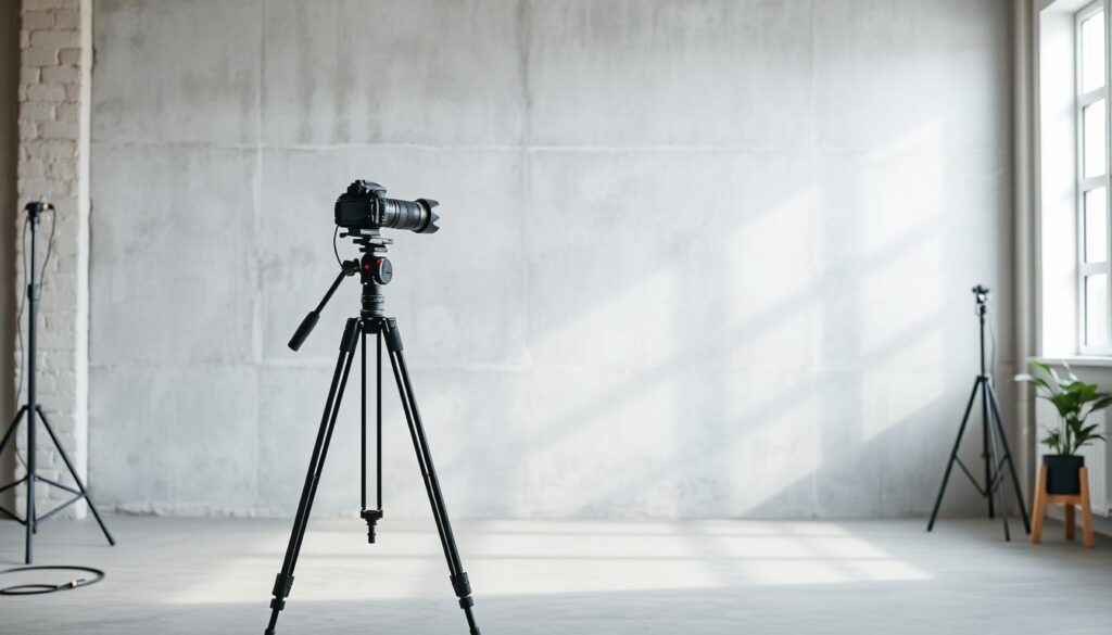
Durability is a hidden cost. A cheap, textured wallpaper might look good for one shoot but could crinkle or fade. A quality canvas or muslin, though more expensive upfront, can last for many shoots. That concrete wall in a downtown loft, on the other hand, is very durable but might require permission and a fee.
So, what’s the best advice? Before spending a lot on backdrops, explore your surroundings. That concrete wall in a downtown alley, the textured plaster in an old library, or the weathered wood of a historic barn are not just backgrounds. They’re stories with real texture. And the best part? They’re often free if you just ask the property owner. For more on budgeting for a professional shoot, from backdrops to lighting, check out our guide to product photography costs.
In the end, the best, most impactful, and cheapest option is often right outside your door. The world is full of textured, character-rich backdrops that cost nothing but a keen eye. Buying is an investment in consistency, renting offers flexibility, but the most impactful texture might be the one you find, not the one you buy.
Sample Looks: 6 combos that always work
Enough theory. Let’s dive into the good stuff. The right backdrop is more than just a background. It’s a key player in your visual story. Here are six tried-and-true combinations that use everything we’ve talked about, from simple backdrops to real textures.
The Corporate Sage: Gray seamless paper meets a sharp, well-tailored suit. This combo is perfect for a classic corporate headshot. The backdrop is simple, letting the subject’s authority and suit shine.
The Creative: Mix a canvas backdrop with subtle texture and simple, high-quality knitwear. This combo adds warmth and authenticity. It shows an artist’s depth without being too loud.
The Industrialist: A raw concrete wall (or a printed backdrop of one) pairs well with a minimalist wardrobe. This look is authentic and urban, great for modern brand photos.
The Artisan: Weathered wood meets natural-fiber clothing. This combo tells a story of craftsmanship and heritage. It’s the ultimate in authentic brand photography.
The Modernist: A soft, gradient paper backdrop matches bold, solid-color clothing. This studio look is clean and modern. The backdrop lets bold fashion choices stand out.
The Editorial: A textured, moody plaster wall lit by a single key light is dramatic. This look is perfect for high-fashion or artistic portraits. The plaster adds depth and shadow.
Each combo respects the data: texture speaks when it should, and recedes when the subject is the star. Your backdrop isn’t just a background; it’s your first, silent argument.