

Let’s face it. You’ve bought that “universally flattering” top, only to look like you’re hungover. We’ve all been there. It’s not the color or your mirror. It’s your skin’s undertone, a secret language.
Your skin’s undertone is like a secret code for your wardrobe. It’s key to finding colors that make you look alive, not pale. Forget what you learned about colors in school. This is about the subtle undertone of your skin.
Want to solve the mystery? You don’t need a lab coat. The white paper test is your first clue. Hold a white paper near your face in natural light. Does your skin look yellowish or pinkish?
Next, try the jewelry test. Does cool metal make your skin bright, or does it wash you out? Does warm, gold jewelry make you look healthier? These tests can reveal more than a therapy session. For more on this, check out this simple color analysis.
This isn’t just about clothes. It’s about the science of hue. Your wardrobe colors for different skin tones in a headshot can make or break your look. Nail your undertone, and you’ll never regret a color choice again.
Palettes for Deep, Medium, and Fair Skin Across Undertones
Forget the old rules of seasonal color analysis. Your perfect colors aren’t just about being a “Winter” or “Autumn.” It’s about how your skin reacts with different colors. Let’s dive into the real world of color.
The Warm Palette: Earth’s Bounty
If your veins look greenish and gold jewelry makes you glow, you’re warm. This palette celebrates the earth: think terracotta pots, autumn leaves, and spices. The key is finding colors that resonate with you.
A warm undertone, with its golden or peachy base, reflects light from within when paired with its soulmates: mustard yellow, burnt orange, olive green, and warm reds like brick or rust. That mustard yellow that makes a cool skin tone look sallow will make you look like you’re lit from within. It’s the Sicilian holiday glow, bottled.
For Warm Undertones (Golden, Olive, Peach)
This palette is your native language. Imagine a deep, golden sunset or a Tuscan landscape. Your colors are rich, like late autumn: think terracotta, ochre, moss green, and burnt sienna.
A deep tan skin with warm undertones shines in burgundy or golden yellow. Fair, peachy complexions look great in coral and salmon. The goal is to find harmony, not contrast.
For Cool Undertones (Pink, Rosy, Blue)
If your veins are blue and silver is your metal, you’re cool. Your palette is like a winter landscape or a deep ocean. Think of the clear, sharp light of a January sky.
Your colors are on the jewel-box side of the spectrum. Think of the clarity of a sapphire blue, a deep emerald, a rich magenta, or a sharp, icy pink. These are your “Winter Tones.” A pastel or a soft, warm beige will wash you out, but a fuchsia or a cobalt blue will make your skin look clear and bright.
For Neutral Undertones (The Chameleons)
You, the chameleon, have won the genetic lottery. Your skin has a balance of warm and cool pigments. You can borrow from both palettes—but with a caveat.
The secret is to avoid colors that are extremely warm or cool. You are the master of the muted, the dusty, and the balanced. Think sophisticated, complex colors: slate blue, dusty rose, sage green, or a soft, true red. You can wear both gold and silver, but a rose gold or a soft pewter might be your perfect, chameleon-like match.
To make this actionable, here’s a cheat sheet for your personal palette, combining the principles of undertone with seasonal archetypes:
| Undertone | Key Palette Colors | Seasonal Archetype (Source 2) | Works Best For Skin Tones |
|---|---|---|---|
| Warm | Terracotta, Mustard, Olive Green, Rust, Amber | Autumn Tones | Golden, Olive, or Peach undertones; deep tans to fair peaches & cream. |
| Cool | Ruby, Emerald, Sapphire, Fuchsia, Silver-Grey | Winter Tones | Pink, Rosy, or Blue undertones; from porcelain to deep complexions. |
| Neutral | Dusty Rose, Sage, Slate Blue, Mauve, Soft Teal | Transitional (Spring/Soft Summer) | Balanced undertones; can pull from both warm and cool palettes in muted forms. |
Background Pairings that Prevent Washout
You’ve found your perfect palette and your power outfit. But even the most flattering ensemble can be sabotaged by a rogue background. The wrong backdrop can drain the life from your complexion, turning a vibrant portrait into a flat, washed-out memory. The goal isn’t just a background; it’s a frame. This is the art of the chromatic chameleon: choosing a background that doesn’t compete, but completes your subject. It’s the final, critical layer in crafting genuinely inclusive headshots that flatter a spectrum of skin tones, ensuring no one gets lost in the frame.
The Chromatic Chameleon: Choosing a Background that Frames, Not Flattens
Think of your subject as the star of the show. The background is the supporting cast—it should elevate, not upstage. The wrong color can make warm skin look sallow or cool skin appear ruddy. The goal is harmony, not competition. A background should provide contrast or complementary energy, creating depth and dimension.
It’s the difference between a subject that looks vibrant and alive, and one that looks like a floating head in a void of nothingness.
For Studio Headshots
In the controlled environment of a studio, the background is a deliberate choice, not a found object. The sterile, all-white or pitch-black void is the color wheel’s nemesis for most. Instead, think of the background as an extension of your subject’s palette.
- For Warm, Golden, or Olive Undertones: A muted, dusty teal or slate blue provides a cool, complementary contrast that makes warm skin glow. It makes golden undertones sing without pulling the skin yellow.
- For Cool or Rosy Undertones: A deep, earthy, warm gray or a muted terracotta can add warmth and depth to cooler complexions, preventing them from looking washed out against a cold background.
- The Neutral’s Neutral: A deep, charcoal grey with subtle texture is the new standard. It’s not a cop-out; it’s a sophisticated, modern choice that provides contrast for both light and deep skin tones without the harshness of pure white or the void of pure black.
For Environmental Portraits
Here, the background is part of the story. The key is to find a background that is complementary but not chaotic.
- Texture is Your Friend: A slightly out-of-focus brick wall, a field of green foliage, or weathered wood can provide a rich, textural backdrop that adds context without competing for attention.
- Color in the Wild: Look for naturally occurring color palettes. The dappled green of foliage can make a warm skin tone glow, while the cool, shadowed side of a building can make a cool-toned complexion look luminous.
- Watch for Color Cast: The green tint from nearby foliage or the warm glow of a neon sign can reflect onto the skin. Be mindful of these ambient color casts, which can be unflattering or difficult to correct later.
To make this practical, here’s a quick guide for matching background tones to skin’s undertone family:
| Skin Undertone Family | Recommended Background Colors | Colors to Generally Avoid | Effect & Reasoning |
|---|---|---|---|
| Warm/Golden/Yellow | Muted Teal, Slate Blue, Charcoal Grey, Olive Green | Bright Orange, Mustard Yellow, Salmon | Cool, muted tones provide contrast that makes warm skin look vibrant, not sallow. |
| Cool/Pink/Rosy | Warm Gray, Terracotta, Sage Green, Muted Mauve | Pastel Pink, Cool Pastels, Stark White | Warms up the complexion; prevents a “washed out” or overly ruddy appearance. |
| Neutral/Olive | Dusty Rose, Sage Green, Deep Navy, Burnt Sienna | Neon or Electric Colors | Neutral complexions can handle more color; these shades add warmth or depth without clashing. |
| Deep Skin with Cool Undertones | Rich Jewel Tones (Emerald, Royal Blue), Cream, Warm Beige | Black, Pure White, Bright Red | Jewel tones complement the skin’s richness, while cream/beige adds a luminous glow without ashy contrast. |
The principle of inclusive headshots is realized right here. It’s not about finding one perfect, universal backdrop, but understanding how color interacts with light and skin. By moving beyond the default grey cyclorama, you can ensure that every subject, regardless of their unique undertones and depth of color, is framed in a light that makes them look—and feel—their absolute best.
Hair and Eye Color Influence on Your Palette
Think your hair and eye color are just for your ID? They’re actually a style cheat code from nature. It’s not just about wearing blue if you have blue eyes. It’s about understanding the contrast level and color intensity your features create.
This decides if you’re bold and dramatic or subtle and toned. It’s like being a Monet or a Seurat.
Beyond the Basics: More Than Just “Blue Eyes, Brown Hair”
Forget the old advice. Saying “blue eyes, wear blue” is like saying all classical music is the same. Someone with deep blue eyes and dark hair can wear different “blues” than someone with pale blue eyes and ash-blonde hair.
The key is value and saturation. Your natural coloring creates a personal value key. It’s like a spectrum from soft, blended looks to stark contrasts. This is your contrast level, and it’s the secret to a harmonious palette.
The High-Contrast vs. Low-Contrast Rule
This is where personal color analysis gets specific. Your natural contrast level shows which colors harmonize with your features.
| Contrast Level | Typical Features | Color Palette Strategy | Celebrity Example |
|---|---|---|---|
| High-Contrast | Deep black or very dark brown hair with fair or pale skin; very light eyes with dark hair. | High saturation, clear jewel tones, stark light/dark combos. They can handle black and white together. | Zooey Deschanel, Anne Hathaway |
| Medium-Contrast | Medium brown hair, medium skin tone, or a mix of medium features. | Medium-value, moderately saturated colors. Avoid extremes of very light or very dark. | Jennifer Lawrence, Jessica Chastain |
| Low-Contrast | Hair and skin tone are similar in value (e.g., blonde hair/fair skin, or auburn hair/fair skin). | Soft, tonal palettes, similar value colors. Avoid stark contrasts. | Nicole Kidman (natural), Gwyneth Paltrow |
For example, someone with high-contrast features (like Snow White) looks great in high-contrast outfits. A cobalt blue dress and black trousers are perfect. But someone with low-contrast features looks better in soft, blended looks.
Eye Color and the Accent Color Theory
Your eye color is more than a feature to match. It’s a accent color generator. The accent color theory says choosing colors within your natural coloring creates a powerful effect.
- Blue Eyes: Don’t just pick any blue. A stormy blue eye looks great with slate gray or denim. A bright blue iris shines with cobalt or periwinkle.
- Brown/Hazel Eyes: This is where it gets rich. A hazel eye with gold flecks looks amazing with terracotta, moss green, or deep teal.
- Green/Hazel Eyes: These are the chameleons. Olive, amber, and even burgundy make green eyes look vivid, pulling from the iris’s undertones.
The goal isn’t to match your eyes to your shirt. It’s to create a dialogue. A person with deep brown eyes and warm undertones looks amazing in terracotta, a color often found in brown eyes. It’s not about matching your eye color, but about echoing and enriching your natural color story.
Metals and Accessories: Gold, Silver, Rose, and Gunmetal
Think of your jewelry metals as a truth serum for your skin’s undertone. Unlike fabric, metal is honest. It shows your true skin color without hiding it.
Forget debates over black and blue or white and gold dresses. The real trick is in your jewelry. It reveals your skin’s true undertone.
Before starting, prepare your face. Pull your hair back and use a headband. Make sure you’re in natural, indirect light. This isn’t about looking good; it’s about science.
The Ultimate Litmus Test for Your Undertone
The veins on your wrist aren’t the best test. The jewelry metals test is more accurate. It’s based on color theory, just like a sunset or a painting.
Your skin has a base undertone, either cool (blue) or warm (yellow/gold). When you mix a warm metal like yellow gold with cool skin, it creates an unflattering greenish cast. This is not a good look.
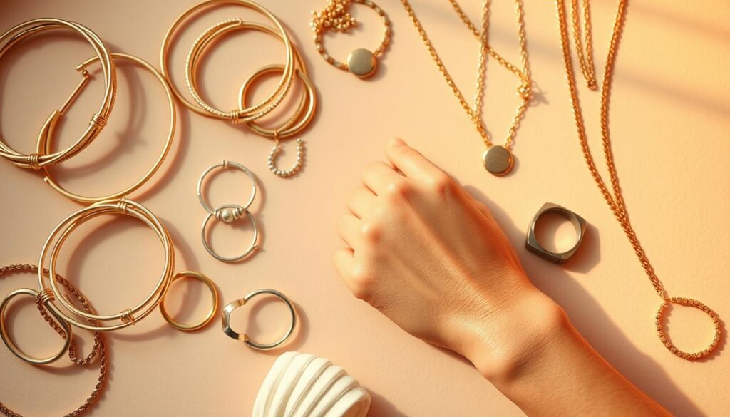
Silver, white gold, and platinum look good on cool skin because they reflect its blue and pink undertones. They make your skin look bright and clear. On the other hand, gold, rose gold, and copper enhance warm skin tones by adding a golden glow.
If silver makes your skin look clear and bright, and gold makes you look sallow, you’re cool-toned. If gold makes you look healthy and radiant, and silver looks harsh, you’re warm-toned.
Mixed Metals and the Modern Rule-Breaking Guide
The modern world loves to break rules. “No mixing metals” is outdated. Mixing metals is all about strategy.
Think of it like a good soundtrack. You can have multiple instruments, but they need to be in the same key. Your dominant metal should match your undertone. A cool-toned person can wear a silver necklace as a base, but a warm-toned gold ring can work as an accent if it’s a deliberate pop.
The secret is proportion and placement. A cool-toned person might wear a silver chain with a single, delicate gold charm. The warm gold becomes a tiny, intentional accent, not a confused pile-on.
Your jewelry metals are more than decoration; they’re a direct dialogue between your accessories and your skin. Listen to what they’re telling you. When they harmonize, you don’t just look good. You look right.
What to Avoid: Near-Skin Tones, High-Sheen Fabrics, and the “Beige Void”
You’ve found your color palette and know your undertones. Now, you’re ready to build a wardrobe that looks great on camera. But first, let’s talk about common mistakes. This guide is about what not to wear. It’s about avoiding the worst fashion crimes, even with the best intentions.
Let’s avoid the beige trap. It’s not just about what to wear; it’s about what not to wear. The worst fashion crimes are often made with good intentions. Let’s steer clear of too much beige.
The Peril of the Flesh-Tone Trap
Here’s a key rule: don’t wear colors that look like they could be part of your body. Wearing a color too close to your skin tone is a big mistake. A warm beige on warm skin makes you look like a floating head. A cool beige on cool skin makes you look like a ghost.
This is where knowing your undertones is key. A warm beige on a cool skin tone looks jarring. It clashes with your skin’s undertones, making you look washed out. You want contrast, not camouflage.
You’ve picked the perfect color. But wait, the fabric matters too. High-sheen fabrics like satin and silk charmeuse create harsh highlights. They make every crease stand out and reflect light in a bad way.
Instead, choose matte fabrics. Think about textures like merino wool, soft cotton, or nubby linen. These fabrics soften your look and frame your face.
Here’s a quick guide to common fabric and color pitfalls and their solutions:
| What NOT to Wear | Why It’s a Problem | The Smart Swap |
|---|---|---|
| Flesh-toned beige or blush (e.g., “nude” shades close to your skin tone) | Creates a “floating head” effect, washes you out, erases your features. | Choose a color with clear undertones that contrast with your skin. For warm skin, try a cool blue. For cool skin, a warm terracotta can be stunning. |
| High-sheen fabrics (satin, silk charmeuse, metallic) | Creates harsh, unflattering highlights, emphasizes texture, and can look cheap on camera. | Opt for matte or textured fabrics: wool crepe, fine-gauge knits, matte jersey, or raw silk. |
| Busy, small patterns or tight stripes | Patterns can “buzz” or create a moiré effect on camera, fighting for attention with your face. | Choose solid colors or very subtle, large-scale, low-contrast patterns. The focus should be you. |
| Pure, stark white (for most skin tones) | Can be too harsh and reflect light back onto the face, creating a washed-out or overexposed look. | Opt for off-white, ivory, cream, or a very pale version of a color that complements your palette. |
The “beige void” isn’t just a color; it’s a mindset. It’s the safe, neutral choice that erases you. Your headshot is your visual handshake—make it memorable. Choose a color that has something to say.
Remember, your clothing is the stage, but your face is the main act. Don’t let your wardrobe upstage you.
Rapid Try-On Workflow for Your Headshot Session
Forget the last-minute panic. A great headshot isn’t an accident; it’s a system. Think of it as a pre-flight checklist for your personal brand. This workflow isn’t about adding more to your to-do list—it’s a cheat code to eliminate guesswork, reduce stress, and guarantee a final image that looks like the best, most confident version of you. Let’s get systematic.
The 5-Minute Pre-Flight Color Check
Before you even think about your closet, do this quick diagnostic. The goal isn’t to overthink; it’s to confirm your palette with a quick, three-step audit. Think of it as the pre-flight check a pilot does before takeoff. This step is the ultimate litmus test to ensure your color choices will work in the real world, not just in theory.
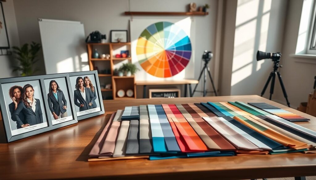
Start with the jewelry test in the same light you’ll be photographed in. Hold a piece of silver and a piece of gold jewelry (or even foil) near your face in a well-lit, natural light setting. The metal that makes your skin look brighter, your eyes pop, and reduces any under-eye shadows is your metallic soulmate. This isn’t just about preference; it’s a dead giveaway for your undertone. Next, grab three tops from your closet: one in your “power color” from your palette, one in a color you love but aren’t sure about, and one neutral. This is your baseline.
The “Three-Shirt Rule” for Headshot Day
On the day of the shoot, you don’t want to guess. You want to execute. The “Three-Shirt Rule” is your tactical plan. Pack three distinct options that you’ve pre-vetted. This isn’t about having a backup; it’s about having options that serve different purposes.
Your three-option arsenal should include:
- The Power Player: Your go-to, the top in your most flattering, palette-approved color. This is your first choice.
- The Confident Contingency: A secondary color from your palette that offers a different feel (e.g., if your power color is a deep teal, this might be a rich burgundy).
- The Classic Neutral: A sophisticated neutral (like a charcoal, navy, or soft oatmeal) that you know photographs well and provides a clean, timeless look.
This system works because it provides a clear hierarchy of choice and eliminates the “I have nothing to wear” panic. It also allows for flexibility with different backgrounds at the studio. For inclusive headshots, this method is powerful. It moves beyond the “one-size-fits-all” advice and provides a structured, yet adaptable, system that works for any skin tone or personal style.
| Shirt Option | Color Strategy | Ideal For | Best Background Pairing |
|---|---|---|---|
| The Power Player | Your single most flattering, on-palette color (e.g., Emerald, Mustard, Royal Blue) | Standard corporate, professional branding, LinkedIn | Neutral or subtly contrasting studio backdrop |
| The Confident Contingency | Secondary palette color; a different value (darker/brighter) or temperature | When you want a distinct look or to match a brand color | Simple, untextured backgrounds to let the color pop |
| The Classic Neutral | Sophisticated neutral (charcoal, navy, heather grey, cream) | Creative fields, more artistic or approachable looks, when the focus must be purely on expression | Virtually any, but excellent with textured or colored studio paper |
Lastly, your Background Check is non-negotiable. If you have any say in the backdrop, use your palette logic. If your top is a rich, deep color from your palette, a light-to-mid gray or soft neutral background will make you pop. If you’ve chosen a neutral top, a slightly deeper or subtly colored background can add dimension. The goal is a harmonious frame, not a fight for attention.
This workflow is your anti-anxiety toolkit. By investing a few minutes in the 5-Minute Pre-Flight and packing your Three-Shirt kit, you’re not just showing up for your headshot. You’re showing up with a strategy. You’re not crossing your fingers for a good shot—you’re engineering it. That’s the difference between a photo and a portrait that works for you. It’s a systematic, stress-free path to a confident and professional result, ensuring truly inclusive headshots that celebrate your best look.
Inclusive Examples and Case Studies
Theory is a great start, but the proof is in the pixels. Let’s see the principles of undertone matching in action. These case studies show how a color shift can transform a portrait from flat to fantastic.
Case Study 1: The High-Contrast, Cool Undertone
A subject with a deep complexion and cool, rosy undertones was dressed in warm beige. This made her skin look drained. For an inclusive headshot, we changed her top to a jewel-toned emerald.
The cool, saturated green matched her undertone, making her skin radiant. The high contrast between her skin, hair, and the top created a striking, professional look.
Case Study 2: The Muted, Neutral Undertone
This subject had a muted, neutral skin tone. They wore a beige shirt against a beige wall, making them almost invisible. The fix was a soft, mid-tone blue-gray.
This neutral shade didn’t compete for attention but framed the face. This is the power of undertone matching for neutral tones—it’s about clarity, not color.
Case Study 3: The Warm, Deep Complexion
A subject with a rich, deep complexion and golden undertones often looks ashy in cool or gray tones. For a truly inclusive headshot, we used a warm, deep terracotta backdrop and a rich, burnt orange shirt.
This warm-on-warm palette amplified his golden undertone, creating a look of radiant vitality. It’s proof that the right palette doesn’t just prevent a bad photo—it builds a powerful, confident image.