
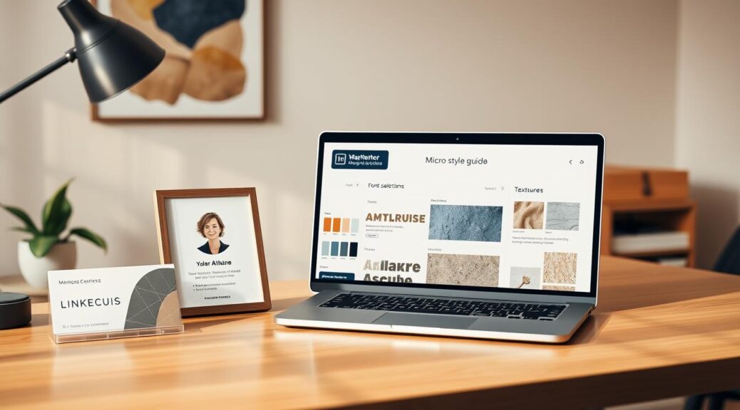
Your personal brand system is like a tailored suit for today’s digital world. It’s the first thing people notice and the last thing they remember. It’s not just about picking colors or fonts. It’s about creating a visual identity that feels consistent, professional, and uniquely yours.
Forget vague terms like “kind of a blue” or “some nice font.” We’re talking about specific hex codes, typeface pairings, and textures that feel right. This is the core of your visual identity, the 90% of communication that happens before you speak. It makes you look like a Fortune 500 company, not a pop-up shop.
Forget about being inconsistent. A strong personal brand system is more than just a logo and color. It’s a personal brand system that looks great everywhere, from LinkedIn to invoices. It’s the difference between being a one-hit wonder and a timeless classic. Let’s create a system that’s as sharp as your ambition.
Cropping Rules: Circle vs. square vs. vertical use cases
Choosing the right crop for your photo is more about understanding the context than following strict rules. Using the wrong crop is like wearing a tuxedo to a beach party—it’s technically correct but completely out of place. The right crop frames your story, guiding the viewer’s eye and setting the scene before they read a word.
Think of your headshot as the frame for your professional persona. A LinkedIn profile pic and a speaker bio photo serve different purposes. Let’s explore the three main types: the professional headshot, the speaker bio photo, and the banner image.
The LinkedIn Headshot (The Thoughtful Square)
This is your digital handshake. Aim for a tight, professional, and engaging close-up. It’s like a business card for your face.
Best For: LinkedIn profiles, company “About Us” pages, email signatures, and any place where a clear, professional identity is key. The focus is on your face and expression.
The Crop: A square or 1:1 aspect ratio is the top choice here. It’s tight, focused, and the platform standard. Crop from mid-chest or shoulders up, with your eyes about one-third from the top. This isn’t for a full-body shot; it’s a conversation starter.
Common Mistake: Standing too far back. You’re not a landscape; we’re here for the professional you. If we can’t see the friendly glint in your eye, you’ve missed the mark.
The Speaker Bio (The Vertical Story)
When you’re the featured speaker or author, you need more than a headshot. This is the “vertical story.” It shows more context—a sliver of your environment, your attire, a prop, a gesture. It’s not just a face; it’s a person in a setting.
Best For: Speaker bios, author pages, guest blog posts, or the “Our Team” page where you want to convey more personality and context. The vertical (or 4:5) aspect ratio is your friend here.
The Crop: This crop is often a 4:5 or 3:4 aspect ratio. It’s the portrait orientation that magazine editors love. It gives you space to show you’re at a lectern, holding a book, or using a prop. It tells a story beyond your face.
The Banner or Hero Image (The Cinematic Wide)
This is the opening scene of your personal brand’s movie. It’s the wide, panoramic shot used in website headers, social media banners, or as a background.
Best For: Website hero sections, LinkedIn or Twitter/X banners, Zoom virtual backgrounds. This is about setting a scene or establishing a mood.
The Crop: Think wide. We’re talking a 16:9 or 21:9 aspect ratio. This is the cinematic widescreen of the crop world. It’s not about your face; it’s about you in an environment—your office, a skyline, a conference stage. It provides context and scale.
| Crop Archetype | Typical Aspect Ratio | Best Use Cases | Watch Out For |
|---|---|---|---|
| The Thoughtful Square (LinkedIn) | 1:1 (Square) | LinkedIn profile, email signature, company directory | Don’t be a floating head. Keep the background simple and uncluttered. |
| The Vertical Story (Speaker Bio) | 3:4 or 2:3 | Speaker bios, author pages, “About Me” sections | Avoid cutting at the joints (knees, ankles, wrists). Crop at mid-thigh or mid-torso. |
| The Cinematic Wide (Banner/Hero) | 16:9 or 21:9 | Website headers, social media banners, video backgrounds | Too much empty “negative space” can look vacant. Balance is key. |
Ultimately, the right crop is the one that fits the frame of your audience’s expectations. The square is your firm handshake, the vertical portrait is your story, and the wide shot is your stage. Choose your crop like you’d choose an outfit for the occasion—context is everything.
Background and Banner Coordination: Echo colors and shapes
Your headshot is like the star of a show. It shines brighter with the right set, lighting, and costume. This means your background and banner should match your brand’s look. It’s all about brand consistency in a visual way.
Your headshot is seen on LinkedIn, your website, or when you speak. It should feel like it’s meant to be there. This is called echo, where your photo and its space have a smart conversation.

The Visual Rhyme Scheme
True brand unity is subtle, like a whisper. It’s about matching your photo with its setting in a harmonious way. This avoids a loud, mismatched look.
For example, if your brand’s color is teal, use it wisely. It could be in your shirt, the banner’s background, or your name. This is the subtle touch that makes a difference.
Practical Application: From Palette to Pixel
Start with your brand’s color palette, which should have 3-5 colors. Use secondary colors for your headshot’s background, not the main brand color. Then, your banner should highlight that secondary color.
Shapes also play a part. If your logo is sharp, choose a background with clean lines. For a more organic feel, use soft textures in your banner.
This approach works for digital and physical spaces. Your headshot and banner should look like they were always together. For more on this, check out our guide on brand identity.
Your Coordination Checklist
Here’s a quick checklist for your next headshot and banner:
- Color Echo: Does a secondary brand color appear in the headshot, clothing, or banner?
- Shape & Line: Do shapes in your logo or brand elements appear in the banner?
- Tonal Consistency: Is the mood of the headshot lighting and banner design the same?
- Negative Space is a Tool: Is there space in the banner for your headshot to connect with text or logos?
This coordination makes your professional image stand out. It’s the difference between a good photo and one that’s unmistakably you.
Negative Space for Designers: Where the copy will sit
In a world full of noise, silence can speak volumes. Think of Miles Davis, who let silence speak on “So What.” That’s negative space in music. In design, negative space is not empty; it’s active. It makes the subject stand out.
For designers, it’s not just empty space. It’s where your name, title, and brand story will shine. We’re not just taking a photo; we’re designing your story’s frame.
Negative Space: The Unspoken Element of Design
The Apple logo is a great example. The simple apple is powerful because of the clean space around it. In a headshot, the negative space is not empty. It gives your image authority and lets designers place your details without clutter.
For the “Sage” archetype, this is key. Your portrait should command attention through thoughtful absence. We frame your face and the idea of you. The negative space builds your credibility, not your face’s pixels.
Designing the Silence: A Practical Guide for Your Headshot
Plan your headshot like a designer. The goal is to blend your image with the text. Here’s how we do it:
- Define the Zones: Map out the “quiet zones” in your portrait. Where does the eye naturally go? That’s where your name goes.
- Consider the Crop: Choose a composition that works with text. A headshot with plenty of negative space is ideal.
- Test with Typography: Try different fonts and sizes. Does your name look natural, or does it feel forced?
Think of it as the Rule of Thirds for Text. We’re not just placing words; we’re creating a unified composition. The portrait and typography become a single, powerful brand asset.
The Designer’s Toolkit for Your Headshot
Your headshot is a puzzle piece in a larger brand system. Here’s what designers need from you:
- Text-Friendly Composition: Shoot with a clear background on one side for a natural text block.
- Consistent Color & Tone: Adjust the color grade and contrast for easy text legibility.
- High-Resolution & Layered: Deliver a PNG version for seamless placement on any background.
Here are some examples of how different negative space compositions serve different design needs:
| Use Case | Negative Space Placement | Ideal For | Designer’s Advantage |
|---|---|---|---|
| Website “About” Page | Space to the right of the subject | Corporate bios, team pages | Allows for a clean, magazine-style text wrap around the portrait. |
| Speaking Engagement Slides | Space above or below the subject | Conference materials, speaker intros | Leaves room for talk title, name, and event branding. |
| Book Jacket or Author Bio | Clear, open space on one side | Author websites, book covers | Space for title, byline, and pull quotes. |
| Social Media Banner | Distributed negative space | LinkedIn, Twitter, website headers | Allows for logo, tagline, and profile details without visual clutter. |
Remember, good design is as little design as possible. The negative space we create is not empty; it’s the visual inhale before your message speaks. We’re not just taking a photo; we’re building your visual brand story. The negative space we craft today is the foundation for tomorrow’s masterpiece.
In the next section, we’ll ensure your perfectly composed image doesn’t get lost in technical translation. We’ll move from composition to delivery with File Delivery: Color Profiles, Sizes, and Naming Conventions.
File Delivery: Color profiles, sizes, and naming conventions
You’ve styled the perfect headshot and matched the brand colors with precision. Now, it’s time to hand it over. This is where your hard work can be ruined by a wrong color profile or a misnamed file. This part is the backbone of your visual identity.
The Unforgiving World of Color Profiles
Many perfect headshots meet their demise here. The difference between a vibrant headshot and a washed-out one often comes down to RGB vs. CMYK and sRGB vs. Adobe RGB. If you get this wrong, your CEO’s blue tie might print as purple on brochures.
For the web, RGB is your world. sRGB is the standard for screens. But for printing, you need CMYK. Always deliver web versions in sRGB and print-ready versions in CMYK with the correct profile. Mismatched profiles are the main cause of color betrayal.
The Great Naming Convention: Your Future Self Will Thank You
“Headshot_Final_v3_updated_FINAL_v2.jpg” is not a professional file name. A logical naming convention is key for brand asset management. A good file name promises what’s inside.
| File Type | Color Profile | Use Case | Naming Convention Example |
|---|---|---|---|
| JPG (High Quality) | sRGB | Website, Social Media, Internal Comms | Smith_Jane_Headshot_Web_SRGB.jpg |
| PNG-24 (with transparency) | sRGB | Website, presentations, digital ads | Smith_J_Headshot_Web_Transparent.png |
| TIFF/PDF (High-Res) | CMYK (Print), sRGB (Web) | Print brochures, annual reports, large-format | Smith_Jane_Headshot_Print_CMYK.tiff |
| Vector (AI/EPS) | N/A (Vector) | Logo placement, large-format printing | SmithJ_BrandKit_Vector.eps |
Notice the pattern: Name_Role_AssetType_ColorProfile_UseCase.extension. This isn’t just for you; it’s for everyone who needs to find the right headshot. Consistent naming is a love letter to your future self and team.
Sizing and Resolution: The Devil in the DPI
A 20MB headshot for a tiny LinkedIn profile picture is too big. A 72dpi image will look bad in a glossy brochure. You need a system for delivery.
Web Use: For web and social, a JPG at 72-150 DPI is standard. Dimensions are key: LinkedIn profile (400x400px), company website bio (800x1200px). Always provide a high-res master file and pre-sized versions for common use cases.
Print Use: This is non-negotiable. Print requires high-resolution files, typically 300 DPI at the final print size. A headshot for a magazine cover needs to be a much larger, high-resolution file than one for a website. For GS1 product image specification, which governs barcodes and product images, can be a useful reference for the level of technical rigor required for consistent, high-quality assets.
The Final Handoff: The “Never Questions” Checklist
Your delivery should be so complete that the recipient never has to ask:
- Did you include a color profile? (Attach the .icc or .icm file or specify sRGB).
- Are the file names consistent and descriptive? (No “IMG_4587.jpg”)
- Did you provide both web and print versions? (With clear labels)
- Is there a README or a simple style guide snippet? (E.g., “Always use the headshot with the blue background for executive bios.”)
Mastering file delivery isn’t just about file formats; it’s about building a system. It’s the final, critical step to ensure your beautifully coordinated headshot with brand kit looks flawless everywhere it lives—from a Slack avatar to a 30-foot tradeshow banner. It’s the silent, unglamorous work that makes a brand look effortlessly, consistently professional.
Testing Across Platforms: LinkedIn, Slack, Zoom, About Page
Your brand’s visual identity is like a diplomat on a world tour. It must adapt from LinkedIn’s professional halls to Slack’s fast-paced channels. Your headshot and branding elements should look good everywhere, from a small Slack avatar to a 4K hero image. It’s not just about looks; it’s about a consistent brand that works everywhere.
Testing is not just a final step; it’s an ongoing process. It’s about stress-testing your visual assets in real-world scenarios. This ensures your brand’s integrity, from a favicon to a full-screen Zoom background. Let’s see how it holds up.
The LinkedIn Litmus Test: Professional Polish or Pixelated Mess?
LinkedIn is like your digital boardroom. Your profile picture and banner are your suit and tie. Test your logo’s recognizability when scaled down to a 400×400-pixel circle. Does your headshot remain crisp and approachable? Does your banner graphic hold its visual weight next to your headline?
A blurry, pixelated profile picture in the professional world is a big no-no. Test across mobile and desktop apps to ensure your brand’s first impression is sharp and professional.
The Slack & Zoom Gauntlet: The Circle of (Brand) Life
Slack and Zoom are the true proving grounds. Your brand assets must be resilient here. In Slack, your circular avatar is your ambassador in every channel. Does your logo or profile picture remain legible and distinct at 36×36 pixels? Does it hold up in dark mode, where many logos with white backgrounds can disappear or create harsh contrast?
Zoom is even more challenging. In gallery view, your tiny profile picture is your entire visual identity. Does it communicate your brand’s tone? And what about virtual backgrounds? Does your logo, when used as a virtual background, become a distracting, tiled mess or a clean, professional backdrop? Test it. Your brand shouldn’t go into a meeting looking like a glitch in the Matrix.
The “About Us” Page: The Big Screen Test
The corporate “About” page is the 4K HDR monitor test. This is where your high-resolution assets live. Does your hero image hold up on a 5K monitor, or does it look stretched and pixelated? Is the color profile consistent with your brand guide, or does it look like a different company’s palette snuck in? This is your brand on the big screen—any flaw is magnified.
Platform-Specific Stress Test Checklist
| Platform | What to Test | Common Pitfalls | Pass/Fail Metric |
|---|---|---|---|
| Profile & Banner Image Clarity | Pixelation in company logo thumbnail | Logo remains clear at 150px | |
| Slack | Avatar visibility in dark/light mode | Logo disappearing on dark theme | Clear visibility in all UI themes |
| Zoom | Virtual background & profile pic in gallery view | Logo distortion, color clash with virtual backgrounds | Brand remains legible at 128px |
| Company Website | High-res asset rendering | Color shifts, pixelation on 4K+ displays | Assets remain sharp at 200% zoom |
This isn’t about vanity. It’s about brand consistency. A pixel-perfect logo on your website that turns into a blurry blob on Slack is a brand consistency fail. It signals a lack of attention to detail. By testing across this spectrum—from the tiny Slack avatar to the full-screen “About Us” banner—you ensure your brand presents a unified, professional front. Your visual identity should be a chameleon, not a one-trick pony. Test it everywhere. Your brand’s visual identity shouldn’t just exist; it should thrive, no matter the screen, platform, or pixel.
Update Cadence: When to refresh and why it matters
Think of your personal brand system like a software update. Your first headshot or a 2020 color palette doesn’t have to last forever. A personal brand is a living thing that needs updates to stay current.
Your visual identity should evolve with you. That 2019 photo with a dated pose and collar has an expiration date. Your brand should grow with you, not stay the same forever.
The 18-24 Month Rule of Thumb
For most professionals, a major brand review every 18 to 24 months is key. It’s not about following every design trend. It’s about checking if your brand is up to date.
Ask yourself if your headshot and visual style match your current role. Does your brand reflect your current authority and industry?
This isn’t just about looking good. It’s about managing your brand like it’s an asset. Letting it get outdated is like letting your domain name expire.
Triggers for an Unscheduled Update
While the 18-24 month rule is good, some life events call for an immediate update. These are your big moments:
- A Major Career Pivot: Moving to a new role or starting your own business means your brand needs to change. It should show you’re independent and a leader.
- Significant Professional Growth: Getting a big promotion or becoming a known voice in your field means your brand should show your new level of authority.
- Industry Evolution: If your industry’s look has changed (like moving from 3D logos to flat design), your brand shouldn’t look old.
- Audience Drift: If your audience has changed (like moving from startups to big companies), your visuals need to connect with them.
Think of it this way: you wouldn’t show up to a meeting with old slides. Your brand shouldn’t be stuck in the past, either.
To understand this, compare it to other lifecycles:
| System | Typical Update Cycle | Why It Matters |
|---|---|---|
| Personal Brand System | Every 18-24 months | Aligns with career progression, ensures relevance, and prevents brand stagnation. |
| Mobile Phone | Every 2-3 years | Hardware/software upgrades; a parallel to a tech refresh for your brand’s “interface.” |
| Car (Lease) | Every 3 years | Controlled, predictable cycle for a major asset; similar to a structured brand refresh. |
| Software (OS) | Yearly (or as updates) | Constant minor patches (like new headshots) and major version releases (full rebrand). |
A personal brand system is a strategic asset, not a static logo. Updating it shows you’re growing. The most successful brands evolve, keeping their look fresh and relevant.
Pre-Press Checklist for Cards and Print
Your brand’s final test isn’t on a screen—it’s in your hand. This is where your digital design meets the real world of paper and colors. A mistake here can ruin your brand’s first impression. Think of this checklist as your shield against blurry logos and wrong text.
It’s the last, non-negotiable step before you send your design to the printer.
1. The Foundation: File Setup
Begin with the right canvas. Your file should be in CMYK color mode, not RGB. The bright red on your screen won’t print the same.
Set your document to the final trim size. And for sharp edges, add a 3mm bleed on all sides. This artwork extends beyond the trim line, ensuring color goes to the edge.
The safe zone is where all important text and logos must stay inside. Ignore this, and your copy might get cut.
2. The Image and Font Lockdown
Your 72 DPI web image is not suitable for print. Every image must be high-resolution, at least 300 DPI at 100% size. Embed all linked images and outline your fonts.
That cool, custom typeface you downloaded? Your printer doesn’t have it. Convert all text to outlines or ensure the font is embedded. This prevents last-minute font substitution disasters.
3. The Color and Proofing Gauntlet
CMYK is the rule here. If you used Pantone colors for a specific brand match, you must specify them as spot colors. The difference between Pantone 185 C and the closest CMYK mix is often a rude, expensive awakening.
Create a proof. Print a physical, 100% size proof to check colors, not just on your screen. Check for typos three times. Then check again.
4. The Final Export and Preflight
Export your final file as a print-ready PDF/X-1a or PDF/X-4. This flattens the file, embeds fonts, and preps it for the press. Ensure crop marks are on, and your bleed and slug areas are correctly set.
Use the “preflight” feature in Adobe Acrobat or your design software to catch any last-minute errors in color profiles or image resolution.
This checklist isn’t just a to-do list; it’s your final quality control. A single misstep here can’t be fixed with an “undo” button. It’s the last, and most critical, handshake between your digital brand and the physical world.