
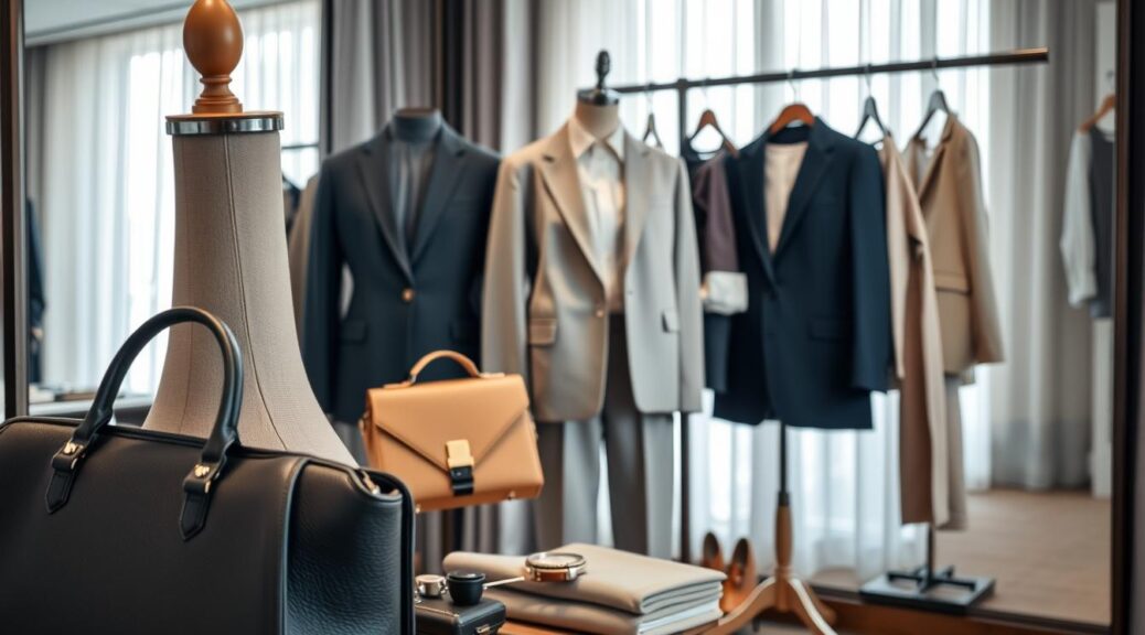
Forget everything you know about getting dressed. This isn’t about fashion. It’s about applied psychology. You’re not just picking clothes; you’re making a first impression.
Think of it as a boardroom in your closet. You’re not just getting dressed; you’re engineering a perception. Do you want to look trustworthy? Choose a navy blazer. Or do you want to show innovation? Pick a bold, brand-aligned accent.
We’re moving past “does this match?” and into color psychology. Deep blues and classic neutrals are timeless and trustworthy. A bold color adds interest and signals intent. It’s not about being loud; it’s about being strategically visible.
This approach is the heart of a personal brand. As we discussed in our piece on building a personal brand, your visual consistency builds trust. Your capsule wardrobe is your uniform. We’re not just choosing clothes; we’re telling your story before you speak.
Build a Core Palette: Neutrals, brand accents, safe backups
Your wardrobe needs a solid foundation, like a good argument. Building a core palette is about creating a timeless look that adapts to any season. It’s like choosing your sartorial starting five, ensuring you look great in any setting.
Your neutral bases are key. Think navy blazers, charcoal trousers, and black sheath dresses. They make your face and message stand out. Colors like navy, charcoal, black, and cream are essential.
But a team needs a sixth man for strategy. This is where seasonal color theory comes in. Your brand’s signature color or a bold hue adds a memorable touch. It’s not about wearing it all over. It’s about adding a statement piece that makes you stand out.
Every team also has a deep bench. Your safe backups are your go-to items. Think classic white shirts and spare blazers. They keep you looking sharp, even in unexpected situations.
| Core Palette Component | Color/Type | Primary Role | Seasonal Color Theory Application |
|---|---|---|---|
| Neutral Base | Navy, Charcoal, Black, Cream | Foundation; projects trust & authority. | Provides a neutral canvas that works with all seasonal palettes. |
| Brand Accent | Brand Color (e.g., Teal, Burgundy) | Strategic highlight; creates memorability. | Uses seasonal color theory to choose the most flattering, on-brand accent hue. |
| Safe Backup | White Shirt, Navy Blazer, Khaki Trousers | Contingency & Versatility | Neutral, classic pieces that work with any seasonal palette in a pinch. |
Mastering seasonal color theory is more than just looking good. It’s about building a system. Your neutrals are your reliable picks, your accent color is the star player, and your backups keep everything running smoothly. It’s not just about dressing; it’s about strategic communication.
Seasonal and Environment Adjustments
Think of your headshot as a scene in a film. The setting sets the costume. A sun-drenched loft needs a different creative direction than a wood-paneled library.
Shooting outdoors? The sun is both your critic and co-star. The “golden hour” glow can make you radiant or washed out. Use rich colors to absorb light and look healthy.
The Indoor/Outdoor Dichotomy
Studio shoots offer control, but be careful. Even light can flatten features. Create dimension with tonal layers.
Seasonal Color Strategy
Your headshot is for the season. A fall campaign might use rust and olive. Spring could have sky blue or lavender.
The Black & White Consideration
For black and white, focus on contrast. Color is irrelevant. Use light and shadow to guide the viewer’s eye.
The Final Cut: Context is King
The right choice fits the environment and story. A tech founder in a t-shirt tells a story of innovation. The right color depends on the setting and story.
Mix-and-Match Capsule: 2 jackets, 3 tops, 2 accessories, 1 hero color
The 2-3-2-1 formula turns clothes chaos into photo gold. It’s not about packing light; it’s about packing smart. We’re building a wardrobe that grows like rabbits, making dozens of looks from just seven pieces.
Forget the “more is more” idea. A capsule wardrobe for photoshoots isn’t about limits; it’s about smart growth. Each piece in the 2-3-2-1 system is a multi-tool, designed to mix, match, and boost your on-camera presence.
The 2-3-2-1 Blueprint: Your Photoshoot Arsenal
This isn’t a random pick of clothes. It’s a smart plan of visual assets.
The 2 Jackets: Your Power Structure
Your two jackets are your anchors. One is your power piece—a structured blazer that commands authority. The second is your texture piece: a smart knit blazer or a textured cardigan. This combo gives you a range from sharp to casual.
The 3 Tops: The Versatile Core
This trio is your foundation. Think of them as your base layer of expression. A crisp button-down for classic look, a high-quality knit for smart-casual, and a simple shell or quality tee. All three should match your jackets and create a versatile core.
The 2 Accessories: Strategic Accents
Two accessories are your visual punctuation. Not clutter, but statement. A bold necklace, a silk scarf, or a signature watch. They’re the exclamation points in your visual sentence.
The 1 Hero Color: Your Visual Through-Line
This is your secret weapon. The hero color isn’t the only color you’ll wear, but it’s the one that appears in every look. It’s the subtle thread that weaves your entire photoshoot narrative together, showing “this was all planned” without words.
For a deeper dive into building a lean, effective wardrobe system, explore our guide on the philosophy of a capsule wardrobe.
| Category | Purpose | Example Pieces | Mix & Match Multiplier |
|---|---|---|---|
| 2 Jackets | Foundation & Structure | Tailored Blazer, Unstructured Knit Blazer | Creates 2 distinct outfit “feels” |
| 3 Tops | Core Versatility | Button-Down, Quality Knit, Silk Shell | Forms the base for multiple looks |
| 2 Accessories | Strategic Accents | Statement Necklace, Silk Scarf | Transforms basics into statements |
| 1 Hero Color | Visual Through-Line | Recurring color in tie, scarf, or jewelry | Creates cohesive visual narrative |
This isn’t just packing light. It’s packing smart. The 2-3-2-1 capsule wardrobe system ensures you arrive at your photoshoot with a curated arsenal, not a chaotic suitcase. Each piece is a multi-tasking asset, and your hero color is the secret handshake that tells a cohesive visual story. You’re not just wearing clothes; you’re directing a photoshoot with the precision of a film director.
Background Pairings: Light, medium, dark, and color wash
Choosing a headshot background is more than finding a pretty wall. It’s about picking a co-star for your story. The backdrop sets the mood and tone before you say a word. The wrong choice can overshadow you; the right one can make you stand out as a brand statement.
This is where seasonal color theory meets environmental psychology. You’re not just picking a color; you’re casting a supporting actor for your show.
The Supporting Actor: Why Your Background Choice is a Co-Star
Think of great on-screen duos like Thelma and Louise or Batman and Gotham. Your headshot needs a similar dynamic. The background should complement, not compete.
A cluttered or mismatched backdrop tells a conflicting story about who you are. Your background should be supportive and make you look your best without stealing the scene.
The High-Key (Light Background)
This is the classic, clean, “corporate headshot” look. A bright, light background (white, light gray, soft beige) creates an open, approachable, and professional feel. It’s the visual equivalent of a firm, clean handshake.
It’s safe, corporate, and universally flattering. The seasonal color theory comes into play here: a light, airy background can wash out certain skin tones if not lit properly. It’s perfect for consultants, therapists, or anyone wanting to project openness and clarity. The risk? It can feel sterile or generic if not paired with the right outfit and lighting.
The Mid-Tone (Medium Background)
The Goldilocks zone. A medium-toned background—think slate grey, taupe, or a soft, muted color—provides separation between you and the background without creating stark, dramatic contrast. It’s the versatile workhorse.
It provides enough depth to make you pop without the high-drama intensity of a dark background. It’s the safe, reliable choice that says, “I’m a professional, not a drama queen.” It’s the background for the person who is confident but not shouting for attention.
The Low-Key (Dark Background)
Dark, moody, and dramatic. This is the power move. A deep charcoal, navy, or black background creates instant gravitas and sophistication. It’s the go-to for creatives, executives, and anyone who wants to project authority and depth.
It’s a classic for a reason: it makes the subject the undisputed focal point. The seasonal color theory principle here is contrast. A dark background makes lighter and more vibrant clothing colors “pop” with incredible force. The danger? If your outfit is also dark, you risk blending into the void, becoming a floating head. Separation is key.
The Color Wash (Strategic Color)
This is where headshots graduate from a portrait to a brand statement. A color wash involves using a colored gel on a background light or a subtle, desaturated wall color that complements your brand palette. This is seasonal color theory in action.
It’s not about a random pop of color; it’s about strategic alignment. A deep teal might convey trust and stability for a financial advisor, while a soft, desaturated orange could signal creativity for a designer. This is the most advanced play, requiring a keen eye for color harmony.

The choice of background color and its intensity can be guided by seasonal color theory. A “Winter” brand (high contrast, jewel tones) would be overwhelmed by a warm, autumnal background. The theory helps you choose a background hue that complements, not fights, your brand’s seasonal palette.
| Background Type | Best For | Seasonal Color Theory Application | Pitfall to Avoid |
|---|---|---|---|
| Light (High-Key) | Corporate, medical, and wellness professionals. Projects openness. | Best for “Spring” and “Summer” color palettes. Avoid with very pale subjects. | Can look sterile or overexposed without proper lighting. |
| Medium (Mid-Tone) | Versatile; suits most professions. The “safe but effective” choice. | Works with most seasonal palettes; a true neutral backdrop. | Can be forgettable if not paired with strong subject contrast. |
| Dark (Low-Key) | Creatives, executives, artists. Projects authority and depth. | Excellent for “Winter” and “Autumn” palettes. Creates high contrast. | Risk of subject blending in if wardrobe is also dark. |
| Color Wash | Strong brand-forward individuals and companies. | Direct application of seasonal color theory. Color should match brand season. | Can look unprofessional if color is too bold or clashes with subject. |
Your background is your first line of non-verbal communication. A light background says, “I am approachable and clear.” A dark one says, “I have authority and depth.” A color wash says, “I have a brand, and I understand its visual language.” The principle of seasonal color theory isn’t just for your wardrobe; it’s the framework for choosing a background that doesn’t just sit behind you, but actively supports the professional story you’re telling. It’s the difference between a headshot and a headshot that works.
Shoot Flow: Sequence looks to protect hair and makeup
Think of a photoshoot like a military operation or a one-person play. The props are set, the lights are hot, and you’re the star. But, if your makeup or hair looks bad, the show will fail.
The sequence of your looks is key. It’s the plan for the day. This is where the creative direction is decided before the first photo is taken.
Your first shot is the most important. Your hair is full, makeup is fresh, and you’re full of energy. This is the time for your most complex look.
This look is the anchor of your brand story. It’s the moment for a bold outfit and a perfect hairstyle. Shooting this first keeps your makeup and hair looking great.
The Hero Shot: Go Big, Then Go Home (for a quick touch-up)
Starting with your most complex look is a smart choice. It captures your character at its best. A perfect blowout or sharp cat-eye shows confidence.
By doing the hardest look first, you use your glam team’s best work. It’s like starting a chess game with your strongest move.
Managing the “Look Lifecycle”
After the hero shot, you need to plan the next look. The second look should be simpler. Swap the big necklace for a small one and let your hair down.
This isn’t a step down in quality. It’s a smart move to protect your stylists’ work. It prevents them from having to redo your hair or makeup.
Creative Direction in Action
This isn’t just about saving a blowout. It’s about managing the whole creative direction of the day. A good photographer or art director is like a stage manager.
They know how to keep your look perfect all day. They plan everything, from what you wear to when you need a touch-up. This careful planning is the backbone of great creative direction.
A well-sequenced shoot respects everyone’s craft and your endurance. It’s a detailed plan that makes your photos look effortless. You’re not just moving from A to B; you’re creating a visual story, one step at a time.
Post-Shoot Selection: Shortlist method and peer feedback
The photoshoot is over. Now, the real work starts. This is where your capsule wardrobe gets judged, not just on a hanger. It’s about picking the right photos, not just the best ones.
Phase 1: The Instinctive Cull (The Easy Part)
First, get rid of the obvious bad shots. Don’t think too much. If it looks bad at first glance, delete it. You’re not saving every photo. You’re choosing the best ones.

Phase 2: The Analytical Shortlist (The Hard Part)
After getting rid of the bad shots, analyze the good ones. Look for the right expression. Your capsule wardrobe shows your professional side. Choose photos that show that side well.
Don’t pick just one. Make a list of your top choices. You want to find the photos that best show who you are.
Phase 3: The Panel of Your Fiercest Peers
Now, get feedback from others. It’s not about who likes your photos the most. Ask someone you trust to pick the photo that looks like you’re a problem solver.
The right photo is not just the one you like. It’s the one that shows your professional side. It’s the perfect accessory to your capsule wardrobe.
Maintenance Plan: Keep pieces ready for future sessions
Your headshot wardrobe is more than just clothes. It’s a key part of your personal brand. After the photoshoot, your maintenance plan turns it into a valuable resource. It’s like investing in your visual identity.
Your core colors, like navy, cream, and charcoal, are a big investment. Taking care of your clothes after the shoot is just as important. Dry-clean your navy blazer right away and store it in a garment bag with cedar blocks. Keep a note on your phone of your favorite outfits.
Seasonal color theory is not just for photoshoots. It’s a living system that guides your wardrobe. Your clothes should change with the seasons, staying true to your color theory. For example, switch from a wool blazer in winter to a linen one in summer.
Good maintenance means you’re always ready. No need to rush to buy new clothes for a last-minute interview. Your core pieces, logged and ready, are your personal brand’s uniform. It’s about looking great, effortlessly, whenever you need to.