

Think your professional headshot is just about looking competent? Think again. That little square is doing more heavy lifting than your entire resume combined.
LinkedIn data reveals headshots get 21x more views. But here’s the real plot twist: your color choices are the silent weapon that separates the memorable from the forgettable.
I’ve seen more careers boosted by a well-chosen navy blue than by any MBA program. This isn’t just aesthetics—it’s psychological warfare in the corporate arena.
The right hue can make you appear slimmer, more trustworthy, or approachable. All before you’ve uttered a single word. Your color psychology choices aren’t decorative decisions—they’re strategic branding moves that speak volumes.
Key Takeaways
- Professional headshots receive 21 times more views on LinkedIn
- Color selection dramatically impacts perceived credibility and approachability
- The right hues can create slimming effects and enhance trustworthiness
- Color choices function as silent psychological communication tools
- Strategic color use represents a critical branding decision, not just aesthetics
- Your visual presentation often speaks louder than your qualifications
What Different Colors Communicate
Ever notice how your clothes talk to the world before you say a word? Color psychology is real, shaping what people think of you fast. Your clothes are like a silent speech, showing who you are without words.
Think about political headshot colors. Why do all candidates wear navy blue? It’s not just because they can’t think of anything else. Blue means “steady hand” and “trustworthy” to our minds. It’s like saying “I’m responsible.”
But blue is just one color in our visual language. Let’s explore what your clothes really say:
| Color | Primary Message | Best For | Cultural Context |
|---|---|---|---|
| Blue | Dependable, calm | Corporate settings | Trustworthiness benchmark |
| Black | Mysterious, sophisticated | Evening events | Power or mourning depending on context |
| White | Pure, perfect | Fresh starts | Bridal and medical associations |
| Red | Passionate, energetic | Attention-grabbing moments | Danger and desire dichotomy |
| Yellow | Happy, intellectual | Creative industries | Caution versus optimism balance |
Red is loud and clear. Wearing red is like adding an exclamation point to your personality. It shows confidence and determination, perfect for showing authority without words. But too much red can make you look like a warning sign.
Yellow is different. It’s bright and optimistic, but can be too much. Corporate America often avoids yellow, which is why you see more beige in offices.
Green is about growth and nature. It’s great for showing stability without being too stiff. Purple is for luxury and creativity, perfect for the arts.
Your headshot colors send a message before you even speak. They’re your first impression, like a silent introduction. Whether it’s for a headshot or your daily clothes, you’re making a statement about who you are.
Flattering Color Choices
Looking good in photos is more than just vanity. It’s about using color psychology to show confidence and vibrancy. Your skin tone is key to your visual presence. Choosing the right colors is a smart move that boosts your personal brand.
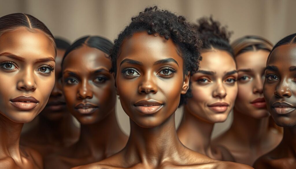
Skin Tone Considerations
Think of your skin as a canvas and clothes as paint. You wouldn’t use neon green on a Rembrandt. So, why do it to yourself? Understanding your undertones is crucial. They decide if colors make you glow or look sick.
Warm vs. Cool Undertones
Warm or cool skin tones are determined by your veins. Blueish veins mean you’re cool. Greenish veins mean you’re warm. Neutral veins? You’re lucky.
Warm Skin Tones: If you’re golden, peachy, or yellow, earthy colors are for you. Terracotta, burnt orange, and olive green make you look like you’re from a tropical paradise. These colors match your natural warmth.
Cool Skin Tones: Pinkish or bluish undertones? You’re perfect for jewel tones. Lavender, plum, and cool grays will make you look alive. These colors highlight your coolness without making you look pale.
Neutral Skin Tones: If you can’t tell your vein color, you’re lucky. You can wear both warm and cool colors. Your versatility is your strength.
Using color psychology is more than just looking good. It’s about showing confidence and professionalism. The right colors can make you look like you know what you’re doing. That’s worth more than any designer label.
Industry Guidelines
Think your favorite electric blue blazer works for every professional context? Think again. The corporate world has its own dress codes, like unwritten rules.
Law and finance are known for their conservative style. They value navy blue and black, showing reliability. Wearing anything too bright might raise questions about your judgment and style.
Creative fields have their own rules. Design studios and tech startups love color. They use pastels, earthy tones, and bright colors to show personality and fit in.
Here’s a quick guide for headshot colors by industry:
- Corporate authority: Navy blue, charcoal grey, black (the holy trinity of “I make decisions”)
- Creative innovation: Earthy tones, muted pastels, strategic bright accents
- Healthcare warmth: Deep greens, soft blues, approachable neutrals
- Tech disruption: Unexpected combinations that still read as intentional
The goal is to speak your industry’s visual language while being memorable. A lawyer might wear a deep burgundy tie with navy. A designer might pair mustard yellow with neutral colors.
Your headshot colors should show you understand your industry. Looking out of place can hurt your credibility. But, if you’re aiming to disrupt, choose colors that reflect your strategy.
These guidelines are not strict rules. They’re a starting point for making choices about your professional image. The best headshot colors are those that balance industry norms with your personal brand.
How to Pair Colors & Neutrals
Think of your wardrobe as a political debate. Neutrals are like the moderators, keeping things calm. Colors are the passionate speakers, making big points. The key is to balance both for the best effect.
Neutrals like navy, black, gray, and beige are your wardrobe’s foundation. They’re steady and don’t grab all the attention. These colors create harmony without being too loud.
Color psychology is your secret tool. A neutral base lets you place colors where they count most. That burgundy pocket square against a gray suit? It’s not a coincidence—it’s a deliberate choice.
Think of neutrals as your canvas and colors as your brushstrokes. This mix adds depth and keeps things professional. It’s like telling a story with your clothes, showing you’re both competent and engaging.
| Neutral Base | Strategic Color Pop | Psychological Effect |
|---|---|---|
| Navy Blazer | Mustard Yellow Tie | Confidence with creativity |
| Charcoal Suit | Emerald Green Shirt | Professional yet approachable |
| Beige Dress | Ruby Red Accessories | Subtle power statement |
| Black Ensemble | Sapphire Blue Scarf | Sophisticated with depth |
Always remember: neutrals should make up 70-80% of your outfit. Use colors for highlights—like ties, pocket squares, or shoes. This adds interest without being too much.
This method works everywhere. Even in business casual, it makes a big difference. You’re not just wearing clothes; you’re making a visual statement.
Neutrals are like the straight man in a comedy duo. They set up the jokes that colors deliver. This partnership makes your outfits communicate, not just cover.
Avoiding the Wrong Palettes
Choosing the wrong colors for your headshot can ruin your professional image. Your headshot colors should support you, not overshadow you.
Patterns can be like that coworker who always tries to outdo you. A floral print can overpower your face. Stripes can make people question their vision, not your skills.
Large logos are another mistake. They’re like free advertising that hurts your professionalism. It’s like wearing a billboard to a fancy event.
Neon colors are for music festivals, not work photos. Colors like electric lime and orange are great for parties but not for work. They can also make your skin look bad, even with editing.
Color clashes are like wearing clothes that don’t match. Some colors together can be too much. A mix of red and pink might look like you’re dressed in the dark.
Your headshot should show you’re a professional, not a piece of art. If people notice your clothes more than your skills, you’ve lost. For tips on good colors, check out our guide to professional headshot colors.
| Color Choice | Professional Impact | Better Alternative |
|---|---|---|
| Busy patterns | Distracts from facial features | Solid colors |
| Large logos | Appears unprofessional | Minimal branding |
| Neon colors | Creates unflattering skin tones | Muted tones |
| Clashing combinations | Causes visual discomfort | Harmonious palettes |
The right headshot colors frame your story well. They should support you without taking over. Think of them as lighting in a gallery, highlighting you, not themselves.
Your clothes should show you’re competent, not try too hard. The best headshots use color to focus attention on you, the professional.
Outfit Examples
Let’s dive into real-life outfit ideas that actually work. No more endless Pinterest searches. These color pairings are like visual shortcuts to looking credible and charming.
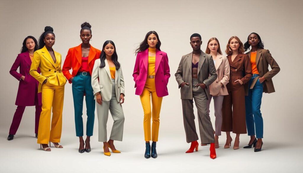
Red with dark brown or purple instantly makes you look authoritative. Imagine wearing a crimson blazer with chocolate trousers. It’s like giving a TED Talk with your clothes.
Yellow with light blue or black is more than just bright. It’s a sign of optimism and creativity. It’s great for jobs where you need to stand out with new ideas.
Blue looks amazing with white or pale green. A navy suit with a white shirt is a classic for a reason. It shows you’re competent and trustworthy.
Green with dark purple or black is like wearing natural armor. These colors suggest stability and growth. They’re perfect for jobs in finance or the environment.
Pink and grey might seem odd, but they’re actually sophisticated. This combo says you’re a creative thinker who respects tradition.
Teal with peach or dark red is modern and professional. It’s like a well-designed app: easy to use but also innovative. These colors are great for tech and design jobs.
Purple with pale green or dark blue adds elegance to everyday clothes. It shows you’re creative but also grounded in knowledge. This is perfect for consultants and teachers.
Remember, colors that are next to each other on the color wheel create harmony. Colors that are opposite each other create tension. It’s like a great debate in your outfit.
These aren’t just random suggestions. They’re based on what photographers and stylists know. They help you look brilliant on purpose, not just by accident.
Conclusion: Own Your Color Story
Your headshot colors are more than just a background. They’re your brand’s first impression. Think of them like a political ad, showing your credibility and creativity.
In today’s fast-paced world, your colors speak volumes before you even open your mouth. They’re the silent message that shows your worth.
Those corporate headshots on LinkedIn? They’re more than just pictures. They’re your visual resume. Picking the right colors is like choosing the right outfit for a big meeting.
Whether it’s navy for trust or crimson for passion, your colors should match your industry’s vibe. It’s all about making a good first impression.
So, take control of your color story. It’s not just about looking good; it’s about standing out. Make your headshot a hit, not just another face in the crowd.