
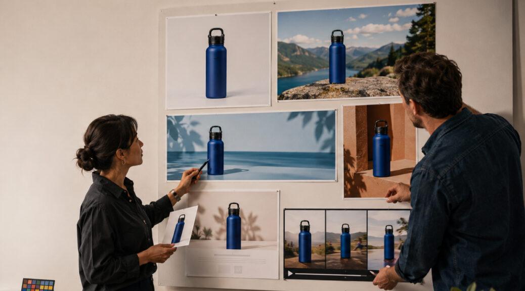
For decades, commercial product photography followed a fairly predictable sequence.
A brand developed a campaign, assembled the product, booked a photographer, built a set, captured a collection of finished photographs, edited them, and distributed those images across advertising and retail channels.
In 2026, that sequence is beginning to reverse.
A product photograph can increasingly become the starting asset rather than the finished campaign.
On August 10, 2026, Kittl published a product-photography workflow by Kezia Sabrina built around precisely this idea: create one accurate master photograph of the real product and transform it into a larger collection of ecommerce images, lifestyle scenes, advertisements, social assets, mockups, and motion content. The argument behind the Kittl product photography workflow is straightforward: modern brands no longer need one photograph for one product page. They need visual assets capable of functioning across an entire digital ecosystem.
That creates an intriguing question for photographers and small businesses.
Can one product photograph really become an entire brand campaign?
Technically, increasingly yes.
Strategically, however, the answer depends on what that original photograph contains, what the brand does with it afterward, and whether visual consistency survives the transformation.
The Product Photoshoot Is Becoming an Input
The biggest conceptual change is understanding that a photoshoot does not necessarily have to produce every finished campaign asset.
It can produce the raw visual foundation from which those assets are built.
Imagine a small skincare company introducing a moisturizer.
The conventional approach might involve photographing the jar against white, building a bathroom lifestyle set, creating another setup for social media, shooting the packaging separately, and perhaps organizing another session when the holiday campaign arrives.
A more modular workflow begins differently.
Photograph the moisturizer accurately once.
Capture its real color.
Preserve the label.
Record the proportions.
Show the surface finish.
Control the reflections.
Create enough resolution for large crops.
Then build campaign variations around that trustworthy source.
The same moisturizer could appear against a clean ecommerce background, inside a lifestyle bathroom scene, within a vertical social advertisement, on a website banner, in an email header, inside a gift-set composition, or within a short animated product reveal.
The campaign changes.
The product does not.
That distinction is fundamental.
One Photograph Cannot Literally Do Every Job
The phrase “one product photo” needs some qualification.
A single front-facing image cannot provide visual information that was never captured.
If customers need to understand the back of a handbag, an AI tool should not invent it.
If a watch has important controls on its side, those details should be photographed.
If a shoe has a distinctive outsole, customers deserve an actual photograph of the outsole.
If a cosmetic package contains information on the back, a beautiful hero image cannot replace a documentary rear view.
One master photograph can therefore become the visual anchor for a campaign, but strong ecommerce photography still benefits from a supporting image set.
Think of the master photograph as the brand’s authoritative visual reference.
Other photographs can provide evidence the hero image cannot.
The Master Photograph Has to Be Exceptionally Accurate
When one image feeds many later assets, small errors multiply.
Suppose the original photograph makes a burgundy bottle appear slightly red.
That may seem minor in one image.
Now reproduce that source across a homepage banner, social advertisement, email campaign, marketplace listing, lifestyle scene, video, and printed sales sheet.
The inaccurate red becomes the brand’s visual representation of the product.
The same applies to shape.
Label placement.
Surface texture.
Proportion.
Finish.
Reflections.
Even shadow behavior can affect how customers perceive materials.
That means the best source photograph is not necessarily the most dramatic one.
It is the most reliable one.
For brands experimenting with new commercial image workflows, Finest Image provides a broader photography and visual-presentation context for thinking about image accuracy, appearance, composition, and how photographs influence perception.
Product Fidelity Matters More Than a Spectacular Background
Generative image tools can produce extraordinary environments.
That can become a distraction.
Imagine a perfume bottle placed inside a cinematic marble bathroom at sunset. Golden light enters through an enormous window. Water droplets sparkle on the counter. Flowers sit softly out of focus behind the bottle.
It looks expensive.
But examine the perfume.
The cap has changed.
The label typography is slightly different.
One corner of the bottle has become curved.
The liquid is a different color.
That image has succeeded aesthetically and failed commercially.
Kittl’s August workflow makes the same distinction: for real products, the product itself should remain fixed while AI is used primarily to develop the surrounding world.
That principle should become one of the central rules of AI-assisted product photography:
Change the campaign, not the product.
One Master Image Can Produce Several Different Assets
A good source photograph becomes valuable because different versions can answer different customer questions.
A clean product-only treatment answers:
What am I buying?
A close crop answers:
What does the material look like?
A scale composition answers:
How large is it?
A lifestyle treatment answers:
Where might this fit into my life?
A promotional layout answers:
What is the campaign communicating?
A short animated version answers:
How can this product attract attention in a motion-first feed?
The important point is that these assets should not merely be duplicates at different dimensions.
Each format has a purpose.
The master image supplies consistency while the composition changes around that purpose.
Brand Consistency Becomes the Bigger Challenge
Creating ten images is becoming easier.
Making all ten look as though they came from the same brand may become harder.
Imagine a candle company producing a week’s worth of AI-assisted creative.
Image one places the candle against pale limestone in soft morning light.
Image two puts it inside a neon-purple nightclub environment.
Image three uses rustic farmhouse wood.
Image four uses glossy black marble.
Image five resembles a clinical laboratory.
Every image could be technically impressive.
Together, they could create no recognizable identity whatsoever.

This is why scalable product photography increasingly requires a visual system rather than a collection of attractive individual pictures.
A brand needs to decide what its imagery should repeatedly look like.
A Photography Style Guide Is Becoming Part of Branding
Traditional brand guidelines typically concentrate on logos, fonts, colors, graphic elements, and tone of voice.
AI-assisted product production makes photography rules equally important.
A useful photography system might define:
| Visual Element | Brand Rule Example |
|---|---|
| Lighting | Large, soft directional light from camera left |
| Backgrounds | Warm neutral surfaces with restrained natural materials |
| Camera angle | Eye level or slight three-quarter perspective |
| Shadows | Soft but visible contact shadows |
| Color | Warm-neutral grading with accurate product color |
| Props | Functional objects only; no decorative clutter |
| Cropping | Product occupies approximately 60–70% of hero frame |
| Negative space | Maintain usable space for advertising copy |
These rules prevent every new generated image from becoming an unrelated creative experiment.
They also make it easier for multiple photographers, designers, marketers, and AI tools to contribute without destroying visual continuity.
Consistency Can Make a Small Brand Look More Established
Commercial photography does more than describe products.
It creates repetition.
Repeated visual characteristics become recognizable.
Consider a small beverage company.
If every bottle is photographed from approximately the same angle, at the same visual scale, under similar lighting, with related backgrounds and consistent color treatment, the catalog begins to feel deliberate.
Now imagine those same bottles photographed randomly.
One image is dark.
Another is bright.
One bottle occupies almost the entire frame.
Another appears tiny.
One photograph has a warm yellow cast.
Another looks blue.
One uses a low camera angle.
Another looks downward from above.
Even if every individual photograph is technically acceptable, the catalog can feel improvised.
An August 2026 analysis by product-imagery specialist Outshinery makes this point specifically for beverage brands: inconsistent lighting, backgrounds, and bottle presentation can weaken the perceived coherence of the digital shelf, where many customers encounter products before ever handling them physically. Its discussion of consistent product imagery and brand perception reinforces why connected images matter beyond simple aesthetics.
Negative Space Is Now a Commercial Asset
Photographers traditionally think about negative space compositionally.
Brands increasingly need to think about it operationally.
A photograph with the product centered tightly in every direction may work perfectly on a product page.
It can become difficult to reuse.
Where does the headline go?
Where does the promotional badge sit?
Can the image become a wide website banner?
Can it be cropped vertically?
Can a designer add pricing without covering the product?
A reusable master photograph should anticipate those needs.
That may mean capturing additional space around the object.
It can also mean photographing the product at a sufficiently high resolution to support different crops.
A seemingly “empty” part of the frame can therefore become valuable campaign real estate.

Background Separation Matters More Than Before
A reusable photograph should also make product isolation relatively straightforward.
This does not mean every product needs to be photographed against pure white.
It means edges should remain understandable.
Transparent glass, loose hair, fur, reflective chrome, lace, translucent plastics, smoke, liquid splashes, and fine jewelry all make separation more difficult.
A photographer planning for reuse should understand whether later assets will require cutouts.
That may influence the background choice, lighting ratio, reflections, or even whether multiple exposures are useful.
The photograph is no longer being optimized only for the first finished image.
It is being optimized for everything that may come afterward.
Lighting Has to Survive the New Environment
This is one of the most difficult parts of turning one photograph into multiple campaign scenes.
Light belongs to an environment.
Suppose a skincare bottle was photographed with a large softbox positioned camera-left.
The left edge of the bottle is bright.
The right side falls into gentle shadow.
Now place that photograph inside a generated room where a visible window on the right produces strong sunlight.
The contradiction becomes noticeable.
The room says the light comes from the right.
The product says it comes from the left.
Even if the viewer cannot articulate the problem, the object can appear pasted into the scene.
Reflective products make the discrepancy worse.
A chrome appliance supposedly sitting inside a dark kitchen cannot convincingly continue reflecting a bright white photography studio.
This is where photographers and retouchers remain essential.
Background generation may be automated.
Believable integration still requires visual judgment.
The Same Product Can Support Different Campaign Moods
Consistency does not mean every photograph needs to be identical.
A brand can vary mood while maintaining identity.
Imagine a premium coffee company.
Its permanent visual language might include warm side lighting, natural materials, low-to-moderate contrast, earthy colors, and restrained compositions.
For spring, the company could introduce pale green and fresh daylight.
For summer, stronger sunlight and cream surfaces.
For autumn, walnut and rust.
For winter, deep green and warm amber.
Those scenes are different.
The underlying photographic grammar remains recognizable.
This is a more sophisticated interpretation of brand consistency than simply putting the same beige background behind every product.
Social Media Changes the Requirements of Product Photography
The modern campaign also has to survive different shapes.
An ecommerce product image may be square.
A website hero is often wide.
Instagram and other feeds frequently prioritize vertical imagery.
Stories and short-form video require even taller compositions.
Email headers may need substantial horizontal negative space.
Paid advertisements can introduce their own safe areas for copy and interface elements.
The photographer therefore needs to think beyond one crop.
One useful approach is shooting slightly wider than the final product-page composition.
Another is creating several master orientations during the same setup.
The goal is not to produce dozens of finished images.
It is to create enough reliable visual information that the campaign can adapt without repeatedly rebuilding the shoot.
Motion Is Becoming Part of the Product-Photo Workflow
The boundary between product photography and product video is also weakening.
A static photograph can now become the starting point for subtle movement, camera pushes, environmental animation, vertical advertisements, rotating mockups, and short promotional sequences.
Kittl’s August 2026 workflow explicitly includes motion as one of the potential outputs derived from the broader product-asset system.
Another August 10 workflow published by CreativeClaw demonstrated the same general concept with a fictional beverage product: one approved visual anchor was developed into a six-asset launch kit including a packshot, lifestyle scene, vertical advertisement, catalog image, transparent cutout, and motion spot. Its one-photo campaign workflow emphasizes preserving the product while changing the surrounding presentation.
This makes high-quality source photography even more important.
A tiny defect that is barely noticeable in one still photograph can become much more distracting when the asset is enlarged, animated, or repeatedly displayed.
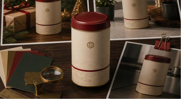
Packaging Needs to Remain Identical
Packaging is one of the easiest places for generative imagery to damage brand credibility.
Logos must remain correct.
Typography must remain readable.
Colors should not drift.
Labels should stay in the correct position.
Bottle caps should not change.
Box dimensions should not subtly expand or shrink.
Patterns should not acquire extra elements.
The more recognizable the package, the less freedom the generative system should have over it.
A useful rule is to treat packaging as protected visual information.
The environment can change.
The surface can change.
Props can change.
Seasonal decoration can change.
The package should not.
One Photo Does Not Mean One Camera Click
There is another important distinction.
A professional master asset may involve considerably more than one exposure.
Reflective products can require multiple lighting passes.
Jewelry may need focus stacking.
Some products benefit from separate exposures for labels and reflective surfaces.
Transparent objects may require carefully controlled background illumination.
A finished “single photograph” can therefore represent substantial photographic work.
That matters when discussing AI efficiency.
Generative tools can reduce the cost of building environments without eliminating the technical difficulty of photographing certain physical products accurately.
The source asset may become smaller in number but more important in quality.
Customer Evidence Still Has a Different Role
A polished brand campaign cannot replace every other kind of imagery.
Customers also want evidence from people who actually bought the product.
That is a different visual category.
Brand photography controls lighting, composition, styling, and presentation.
Customer photography provides evidence of what the product looks like outside that controlled system.
Both can be useful.
Brands should therefore avoid using AI to fabricate supposedly spontaneous customer photographs or reviews.
The campaign can create aspiration.
Real customer media provides a different form of trust.
Those functions should not be confused.
Small Brands Can Benefit Disproportionately
The new workflow may be particularly important for small businesses because traditional campaign production is expensive.
A large company can photograph one product on five sets.
A small business may have enough budget for one strong shoot.
If that single session creates accurate, reusable master assets, the smaller brand can potentially extend those photographs much further.
One candle photograph might support:
an ecommerce hero,
a lifestyle scene,
an email banner,
a vertical social advertisement,
a seasonal promotion,
a wholesale sheet,
a marketplace image,
and a short animated asset.
The business does not suddenly have the production budget of a global brand.
It gains more ways to use the photography budget it already has.
More Assets Do Not Automatically Mean a Better Campaign
There is an obvious danger.
When producing content becomes cheap, brands can produce too much of it.
Twenty generated lifestyle scenes are not automatically more useful than four excellent ones.
One hundred social graphics can weaken a visual identity if each uses a different style.
The ability to create more should therefore increase the importance of editing.
Ask what each image does.
Does it show something new?
Does it answer a customer question?
Does it fit the brand?
Is the product accurate?
Does it work in the intended channel?
Would removing the image make the campaign less informative?
If the answer to the last question is no, the asset may not be necessary.
Photographers May Become Visual-System Designers
The photographer’s role is likely to evolve alongside these tools.
A client may no longer ask only:
“Can you photograph this bottle?”
They may ask:
“How should we photograph this bottle so we can build an entire launch around it?”
That requires different thinking.
The photographer has to consider extraction.
Cropping.
Multiple formats.
Color consistency.
Future backgrounds.
Reflections.
Motion.
Scale.
Detail images.
Seasonal reuse.
The photographer begins designing a visual system, not simply making an attractive picture.
That can make commercial photography more strategic.
The Real Value Is Not One Photo but One Visual Truth
So, can one product photograph really become an entire brand campaign?
It can become the anchor for one.
The distinction matters.
A single photograph cannot magically reveal every side, function, texture, dimension, or detail of a physical object.
It cannot replace documentary images customers genuinely need.
It cannot guarantee that every generated scene will remain accurate.
But one carefully made master photograph can establish the visual truth from which a surprisingly large campaign grows.
Kezia Sabrina’s August 10 workflow captures why this idea is gaining relevance in 2026: a product image now has to operate across stores, marketplaces, emails, social posts, advertisements, mockups, and increasingly motion rather than living on one product page.
That changes what brands should demand from product photography.
The goal is no longer simply to make one beautiful image.
It is to create a trustworthy image that remains useful after the original photoshoot ends.
For photographers, that means accuracy, flexibility, resolution, lighting discipline, and an understanding of brand systems become more valuable.
For businesses, it means the real opportunity is not generating endless pictures from one source.
It is maintaining one recognizable visual identity while the product moves through many different pictures.
The strongest campaign will not be the one that makes a single photograph look like a hundred unrelated images.
It will be the one where those hundred possibilities still unmistakably look like the same product from the same brand.