Fashion photography now lives overwhelmingly on screens. A campaign can appear on a retailer’s homepage in the morning, become an Instagram post that afternoon and be reformatted into vertical video before the day is over.
Nordstrom’s Fall 2026 designer campaign deliberately adds something much more physical to that system: paper.
The Seattle-based retailer launched “Friends of Friends” in September 2026, with photographer Ethan James Green shooting the campaign and Dara Allen handling styling. Set designer Marcs Bird and artist Drake Carr also contributed to the visual world surrounding it.
The campaign features designer fashion from labels including Bottega Veneta, Sacai, Balenciaga, Tom Ford, Khaite and Thom Browne, and it is appearing across Nordstrom.com and the retailer’s social channels.
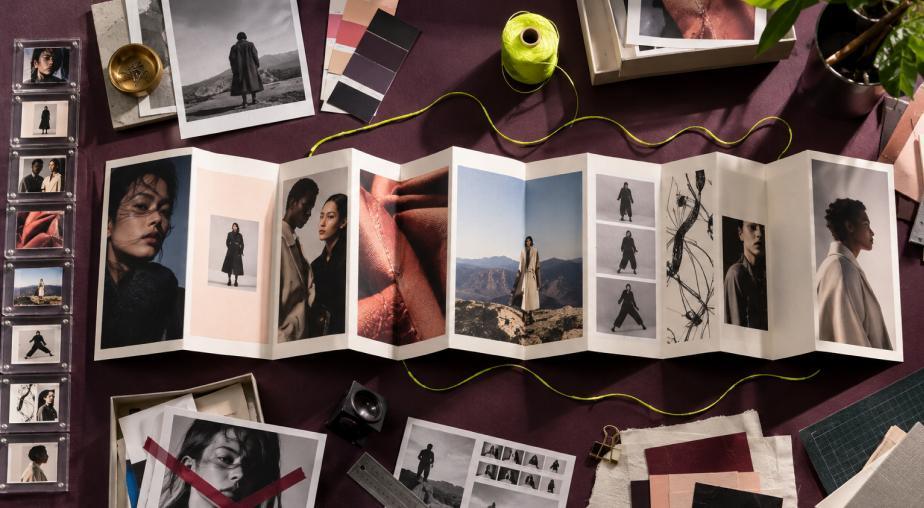
But Nordstrom also produced a special printed mailer.
That decision looks almost counterintuitive in a fashion industry obsessed with digital reach. Yet it may be one of the campaign’s most interesting visual choices.
The printed piece turns photographs that could have disappeared into an endless feed into objects people can hold, sequence, revisit and potentially keep. In the process, it raises a bigger question for photographers and brands: can making an image physically harder to ignore make it feel more valuable?
Friends Of Friends Treats Fashion As A Creative Network
The title “Friends of Friends” is important because Nordstrom is not presenting Fall 2026 simply as a catalog of expensive clothing.
The campaign is built around a creative network.
Green photographed it. Allen styled it. Bird contributed set design. Carr contributed art and illustration. The cast also brings together artists, models and people connected to that creative circle.
Fashion publication Vogue highlighted that collaborative idea when covering Nordstrom’s campaign celebration on September 10, 2026, at Marcel at Sotheby’s on Madison Avenue in New York City. The event arrived on the eve of New York Fashion Week and brought together designers, fashion executives and other industry figures around the campaign.
The visual strategy therefore fits the title.
Rather than making the retailer itself the only personality, Nordstrom is using photographers, stylists, artists, designers and subjects to create a broader image of contemporary fashion culture.
That makes the print format particularly appropriate.
A social post usually isolates one image.
A printed mailer can establish relationships between many images.
Ethan James Green Is A Significant Choice For The Campaign
The selection of Ethan James Green gives the campaign another layer.
Green is known for fashion and portrait photography that can feel more observational and character-driven than conventional ecommerce imagery. His work has appeared in major fashion publications and exhibitions, and his photographs frequently emphasize the person wearing the clothing rather than treating the model simply as a structure on which garments are displayed.
That approach aligns naturally with a campaign called “Friends of Friends.”
The purpose is not merely to communicate that Nordstrom carries a particular coat, shoe or bag.
The photographs can communicate who might inhabit this fashion world.
That distinction matters for a multi-brand retailer.
A fashion house can establish one tightly controlled universe around its own collection. Nordstrom has to place very different labels into a visual environment that still feels coherent.
According to coverage of the campaign, the Fall 2026 imagery includes looks from Bottega Veneta, Sacai, Balenciaga, Tom Ford, Khaite and Thom Browne, among others.
Those houses do not have identical identities.
Photography becomes the connective tissue.
A Printed Mailer Changes How A Photograph Is Seen
A photograph encountered on a phone is usually competing with something else.
There is another post underneath it.
Notifications can appear above it.
The viewer can swipe away instantly.
Even a striking fashion photograph exists within an interface designed to keep moving.
A printed mailer removes much of that competition.
There is no notification arriving over the model’s face.
There is no autoplaying video underneath the photograph.
There is no infinite feed waiting one finger movement away.
The viewer has to physically turn a page or unfold the material.
That changes the pace of looking.
The image has a fixed physical size.
Paper provides texture.
A photograph on the opposite page affects how the first photograph is interpreted.
White space becomes actual space rather than unused pixels.
For fashion photography, those characteristics can be creatively valuable.
The printed object can make an image feel less temporary.
Dara Allen Described The Format Through Nostalgia
The analog quality was not accidental.
In its coverage of the launch, Vogue described the printed format as simultaneously nostalgic and timely.
Allen’s involvement is especially relevant because she is not only styling individual outfits. Styling has to work across the complete visual sequence.
A digital campaign can be consumed out of order. Someone might encounter image six without ever seeing images one through five.
A mailer can impose a stronger sequence.
The first photograph introduces the world.
The next expands it.
A detail image can interrupt a portrait.
An illustration can change the rhythm.
A quieter photograph can prepare the viewer for a more visually intense spread.
That makes the printed campaign closer to editorial design than a collection of independent social posts.
The photography is not merely published.
It is paced.
Print Creates Scarcity In A World Of Infinite Images
Digital photography has an unusual abundance problem.
Brands can publish more images than ever before.
Production tools are faster.
Campaigns can generate numerous crops and variations.
Social platforms encourage continuous posting.
AI tools can expand backgrounds, create alternate compositions and accelerate adaptation.
The result is an almost unlimited supply of visual content.
But human attention has not expanded at the same rate.
A printed object introduces friction into that system.
It costs money to manufacture.
It has to be designed at fixed dimensions.
Someone has to decide which photographs deserve the available pages.
It has to be physically distributed.
Those limitations force selection.
And selection can create perceived value.
A photograph included in a finite printed piece feels different from one of dozens uploaded to a social account.
The limitation becomes part of the presentation.
Nordstrom Is Not Abandoning Digital
The mailer should not be mistaken for a rejection of digital marketing.
“Friends of Friends” is also being distributed through Nordstrom’s website and social channels.
That makes the strategy more interesting.
Nordstrom is not choosing print instead of digital.
It is assigning print a different job.
Digital distribution provides reach, speed, accessibility and the ability to move consumers toward products immediately.
Print provides tactility, pacing and physical presence.
The same campaign can therefore behave differently depending on where someone encounters it.
On social media, a Green photograph has to earn attention quickly.
Inside the mailer, it can be part of a visual sequence.
On Nordstrom.com, the imagery can connect directly with shopping.
The campaign is not one format copied three times.
It is one visual identity operating through several formats.
The Edit Makes The Mailer More Than An Advertisement
Nordstrom is also using the mailer to introduce a new vertical called The Edit.
Industry coverage says The Edit features a curated group of wardrobing brands including Heirlome, Colleen Allen, Kallmeyer and High Sport, among others.
That section was styled by Becky Malinsky and photographed by Tommy Ton.
This adds an important layer to the print strategy.
The mailer is not functioning only as advertising space for the main campaign.
It can also behave as a form of curated fashion publishing.
That distinction is increasingly important for retailers.
Online stores are extraordinarily efficient at showing inventory. Filters can organize thousands of products by category, brand, color, size and price.
But efficiency does not automatically create taste.
Editorial photography and curation can tell the customer what deserves attention and why several seemingly unrelated pieces belong together.
A printed format is particularly suited to that role because the sequence itself becomes an editorial decision.
Nordstrom Is Selling Discovery Alongside Clothing
Nordstrom executive vice president Yumi Shin has connected the Fall 2026 designer push with self-expression, discovery and the retailer’s expanding luxury offering.
That language helps explain why “Friends of Friends” needs more than conventional product photography.
Discovery requires context.
A white-background product photograph can tell someone what a garment looks like.
A campaign photograph can tell them what the garment feels like within a life, personality or visual culture.
That is where fashion photography becomes commercially useful without behaving like straightforward sales photography.
The customer may discover a designer because they like the character in the photograph.
They may notice an unexpected combination of garments.
They may remember a color relationship.
They may recognize themselves in a styling decision rather than in a specific product.
Nordstrom’s 125th anniversary strategy provides broader context for that approach. Throughout 2026, the retailer has emphasized brand partnerships, discovery and experiences as it marks 125 years since its founding.
“Friends of Friends” fits naturally into that larger effort.
A Multi-Brand Retailer Needs A Strong Photographic Point Of View
Nordstrom faces a visual challenge that individual designers do not.
It sells other companies’ identities.
Bottega Veneta already has a visual language.
Tom Ford has one.
Thom Browne has one.
Balenciaga has one.
Put them all on a retailer’s website without strong art direction and the result can feel like disconnected inventory.
A campaign photographer helps create a temporary common language.
Lighting can connect the clothes.
Portrait treatment can connect the subjects.
Set design can connect environments.
Styling can create relationships between labels.
Graphic design can establish rhythm.
That does not erase each brand’s identity.
It creates a Nordstrom perspective through which the customer encounters them.
The printed mailer makes that curatorial role particularly visible because all those choices exist inside one physical object.
Paper Changes The Photographer’s Composition Problem
Designing photography for print also creates different compositional demands.
A photographer working primarily for social media knows that images may eventually be cropped into square, 4:5 or 9:16 formats.
Print introduces other concerns.
Will the image cross a fold?
Does the subject sit too close to the gutter?
Should one photograph occupy an entire page?
Does a horizontal photograph work across a spread?
How does a portrait interact with typography?
What happens when two photographs face each other?
These are not merely graphic-design questions.
They influence how photographs are selected and sometimes how they are shot.
A wide environmental portrait that feels small on a phone can become spectacular across a printed spread.
A subtle facial expression that disappears inside a busy webpage may gain significance when it occupies an entire page.
Print changes scale, and scale changes meaning.
Physical Photography Can Feel More Personal
There is another reason a mailer makes sense for a campaign centered on friends and individual style.
Physical photographs have long been associated with personal exchange.
Photo albums are physical.
Family snapshots were passed around.
Postcards traveled between people.
Magazines were collected.
Fashion editorials could be torn out and pinned to walls.
Digital images are easier to distribute, but physical images can be easier to associate with possession.
A customer receiving the Nordstrom piece does not merely encounter the campaign somewhere online.
The campaign arrives in their physical environment.
It can sit on a coffee table.
Someone else in the household can pick it up.
A page can be revisited days later.

Whether recipients actually keep the mailer will vary, but the possibility itself changes the relationship between viewer and image.
The Campaign Arrives During Nordstrom’s 125th Year
The timing also gives the analog choice additional meaning.
Nordstrom is celebrating its 125th anniversary in 2026.
Earlier this year, the company introduced “Based on a True Story,” a campaign built around real customer experiences and familiar spaces such as its shoe departments, cafés and fitting rooms.
Nordstrom described that campaign as a way of connecting its history of service with the experiences customers continue to have with the company.
The Fall campaign is visually different, but both projects share an interest in human relationships.
One looks toward customer memories.
The other uses a network of creative friends.
Against that background, using a physical mailer does not feel like random nostalgia.
It creates a bridge between the department store’s long history of physical retail and a contemporary fashion audience accustomed to discovering style digitally.
Print And Social Media Can Make Each Other More Valuable
The most useful lesson from “Friends of Friends” is not that brands should return entirely to catalogs.
That would misunderstand what Nordstrom is doing.
The retailer still needs digital distribution.
Consumers still discover fashion through phones.
Social platforms remain essential places for photography.
What the mailer demonstrates is that not every image has to perform the same job.
A social photograph can generate immediate attention.
A website photograph can help someone shop.
A printed photograph can slow the experience down.
A campaign becomes stronger when each format uses its own strengths rather than when the same asset is mechanically copied everywhere.
That is especially relevant as brands become capable of producing more imagery with less effort.
When visual content becomes easier to generate, presentation becomes more important.
The Rarest Image May Be The One You Can Hold
Nordstrom’s decision to print “Friends of Friends” ultimately says something larger about photography in 2026.
Digital abundance has not made physical images meaningless.
It may have done the opposite.
A printed photograph now feels unusual precisely because most photographs are not printed.
A mailer requires commitment to particular images, particular sequencing and a particular physical presentation.
That commitment can make the photography feel more intentional.
Ethan James Green’s images can still circulate through Nordstrom’s social channels and website. They can reach far more people digitally than a printed piece ever could.
But the mailer gives those photographs another life.
They become pages rather than posts.
They acquire scale rather than responsive dimensions.
They exist beside one another instead of appearing individually in a feed.
And they ask the viewer to do something increasingly uncommon:
stop scrolling and actually hold the image.